The Footer Builder in PixeBuilder is a specialized tool that allows you to create, manage, and deploy custom footers for your WordPress site. Like the Header Builder, it offers both ready-made templates and a canvas for completely custom designs.
Create Footer Template
Here are a few simple steps to create the footer template:
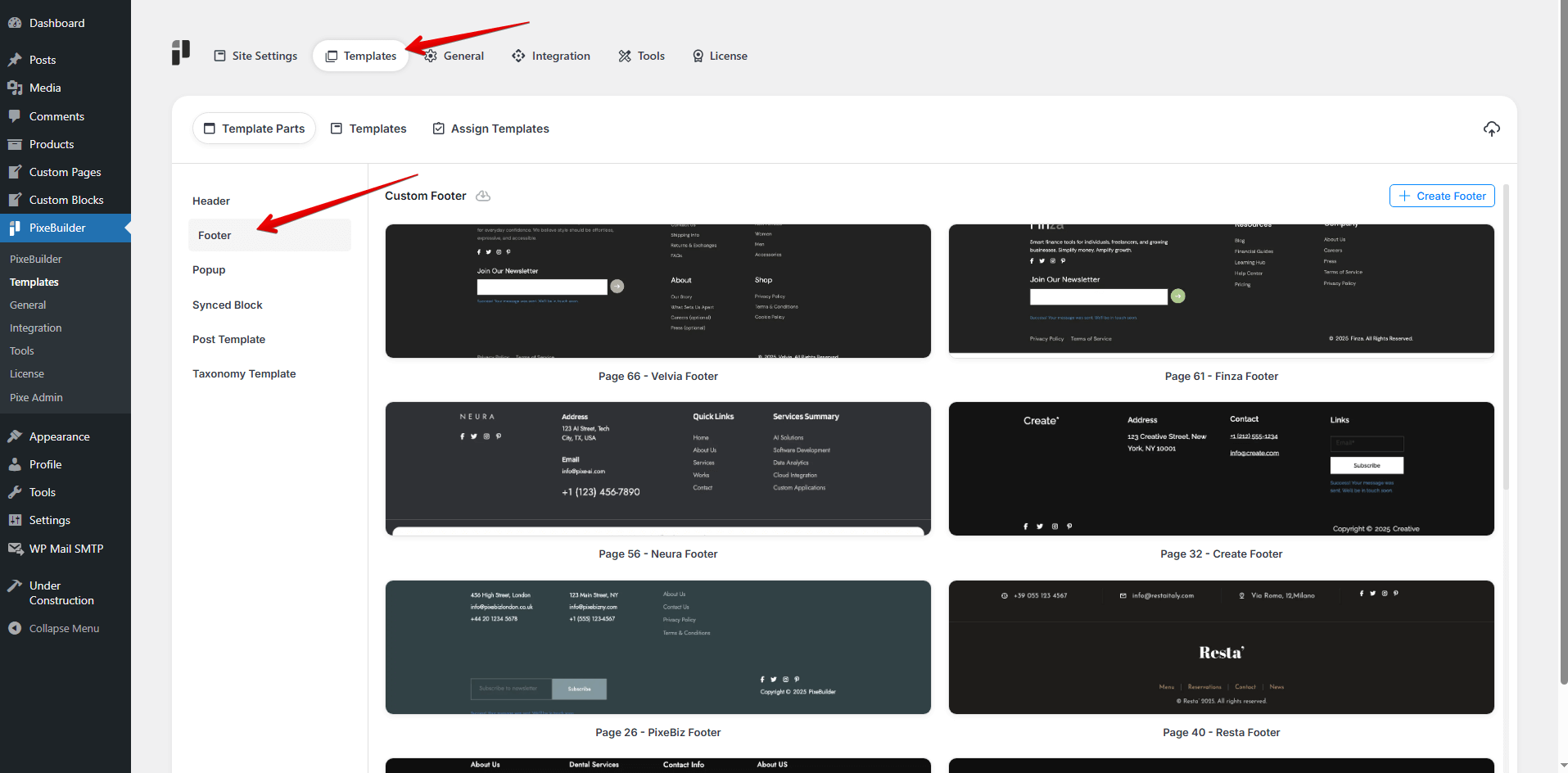
- Go to Pixe Settings
- Access Template Parts
- Click on Footer
- Click Create Footer
- Enter a Template Name
- Design your custom footer here
Footer Template Structure
We usually include the following elements in the footer structure:
- Text Widget
- Navigation Menu
- Recent Posts
- Search Box
- Social Media Icons
- Newsletter Signup Forms
- Custom HTML/CSS
- Contact Info – Email, phone number, address
- Image or Logo Widget
- Legal Information or Company Information
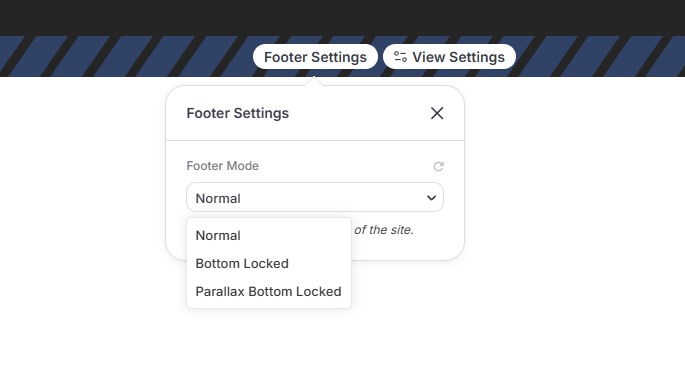
Footer Modes
The Footer Builder provides specialized modes to control how the footer sits at the bottom of your site:
-
Normal: The footer follows the standard page flow at the end of the content.
-
Bottom Locked: The footer is permanently fixed to the bottom of the browser window.
-
Parallax Bottom Locked: The footer is fixed at the bottom and is revealed with a parallax scrolling effect as the user reaches the end of the page.
Note: These modes only display on the front end of the site.
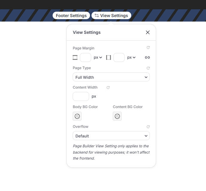
Footer View Settings
The View Settings allow you to control the structural layout of the footer area. These settings apply only to the backend for viewing purposes and do not affect the frontend.
-
Page Margin: Adjust the external spacing around the footer container.
-
Page Type: Choose between Full Width or Boxed Width layouts.
-
Content Width: Set a specific value for the maximum width of the footer content.
-
Body & Content BG Color: Independently set background colors for the overall footer area and the content container.
-
Overflow: Manage how content that exceeds the footer container is handled with Visible or Hidden options.
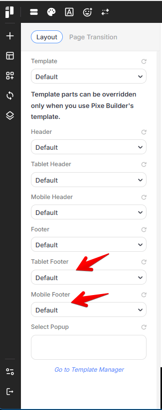
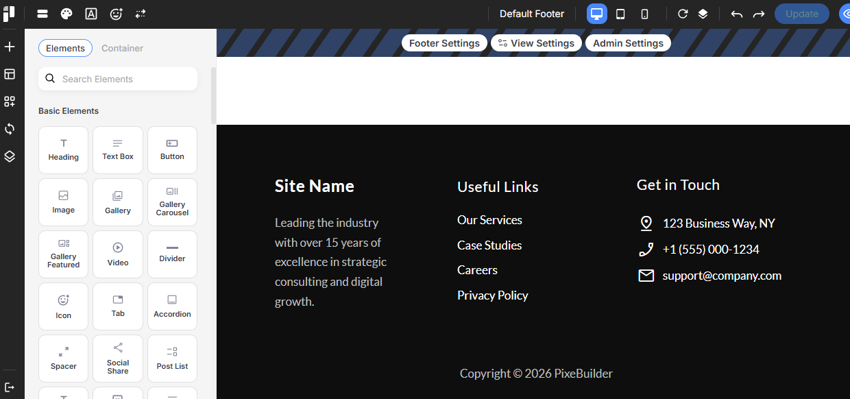
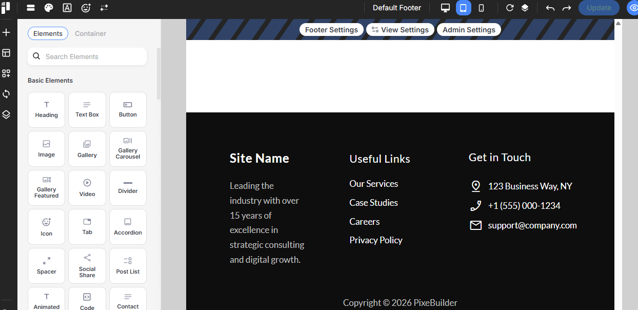
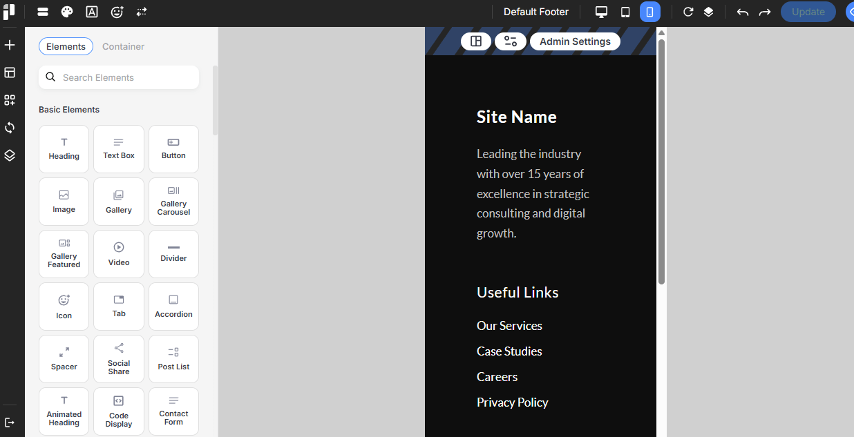
Responsive Display Settings
PixeBuilder ensures your footer looks perfect on every device by providing dedicated viewports for customization:
-
Desktop: Standard view for large computer screens.
-
Tablet: Adjust layouts and dimensions for medium-sized touch devices.
-
Mobile: Optimize dimensions and spacing for handheld devices to ensure a clean, vertical layout.
Simply click the icons to enable or disable visibility for each device type.
Desktop
Tablet
Mobile
Customizing Footer By Device
With PixeBuilder, you can create entirely different footer templates for different devices. For example, you can assign a simplified footer for mobile devices while keeping a more detailed version for desktop users.
Use the Assign Templates tab to define these specific display rules.