Page Builder Screen
We will break down four areas in the page builder interface based on the screenshot below.
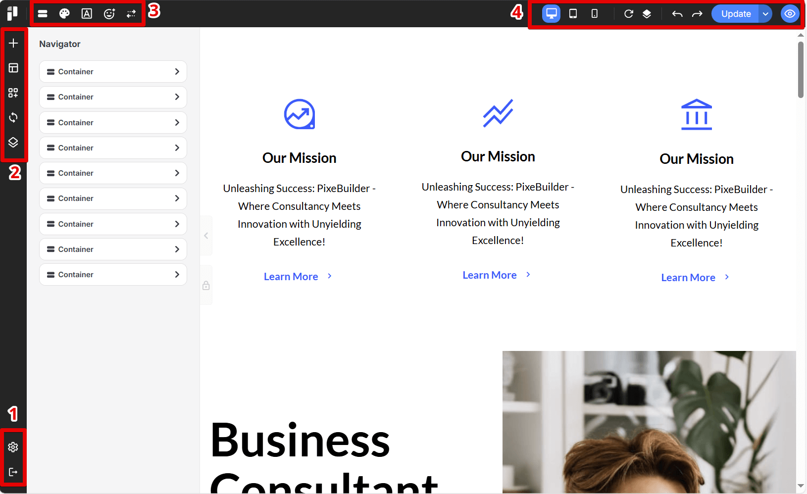
1. Settings & Exit
This area contains the settings and exit icons for the Pixel Builder.
Settings
Opens the settings panel for the page in the Pixel Builder, allowing you to configure various page options.
Exit
Closes the Pixel Builder and returns to the main page.
2. Elements, Blocks & Templates
In this section, you can choose elements, blocks, and templates. You can also access sync blocks here.
Elements
Opens a panel containing a variety of basic design elements that can be added to the current project.
Blocks
Provides access to pre-designed content blocks or sections.
Custom Blocks
Allows you to save and reuse frequently used layouts or components.
Sync Blocks
Enables synchronization or updates for blocks that are used across multiple locations.
Templates
Opens a library of pre-built page and website templates.
3. Navigation & Presets
The Navigation panel allows you to arrange elements, and we have also included preset settings here.
Navigation
Opens a menu to manage site navigation elements such as page structures.
Color Presets
Provides access to pre-defined color palettes or themes.
Typo Presets
Opens a panel for managing typography settings, including font families, sizes, weights, and styles.
Icon Presets
Offers access to a library of icons or pre-defined icon sets that can be used in the design.
Control Presets
Manages settings or presets related to interactive elements or controls within the design.
4. Responsive, Revision & History
This section includes tools for simulating responsive design, tracking revisions, and viewing the history of your actions. Please note that the history resets when the page is closed or reloaded.
Responsive Simulation Tool
Allows users to preview and test how their design will appear on different screen sizes and devices (desktop, tablet, mobile).
Revision
Lets users create or save specific versions or snapshots of their work, enabling them to revert to previous states if needed.
History
Opens a panel displaying a chronological list of changes made to the design, allowing users to step back to previous states.
Undo & Redo
Provides standard undo and redo functionality, allowing users to reverse or reapply recent actions.
Update / Switch to Draft / Preview / View Page
This button initiates an update or save of the current design. The dropdown provides additional options such as saving as a draft, previewing the page, or viewing the live page.
Preview & Close Preview
These buttons toggle preview mode, allowing users to see how the design will look to visitors. The eye icon opens the preview, and the eye with a slash closes it.