The Contact Form element in PixeBuilder provides a comprehensive toolset for creating custom user interaction forms. It combines granular field-level control with global styling and advanced integration options like email routing and reCAPTCHA.
Adding and Managing Fields
You can dynamically build your form directly within the editor interface:
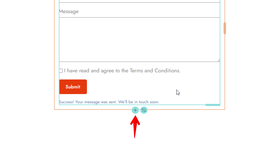
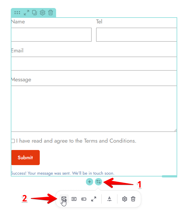
Adding New Fields: Click the plus (+) icon located at the bottom of the form element to insert new input fields.
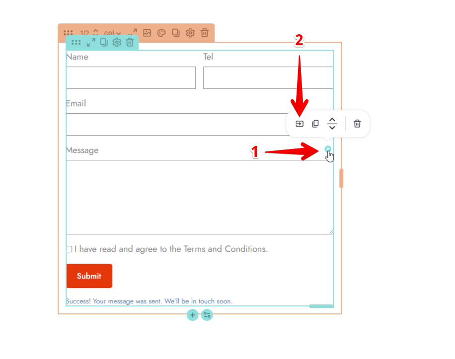
Managing fields/Field-Level Settings: Click the icon in the top-right corner of an individual field to open the Field Settings drawer.
-
-
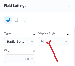
Type: Define the input type, such as Text, Textarea, Email, Number, Tel, Select, Select Multiple, Acceptance, Checkbox, Radio Button, Date, Time, Password, Hidden or Upload.
-
Width: Set the field width using the col, %, px, or auto value.
-
Content: Customize the Name, Label, and Placeholder text.
The Name field set here can be used as a shortcode in the Custom Message option(see below). -
Requirements: Toggle Required status and the Show Asterisk indicator.
-
Order: Use Bottom Order to numerically define the vertical position of the field.
-
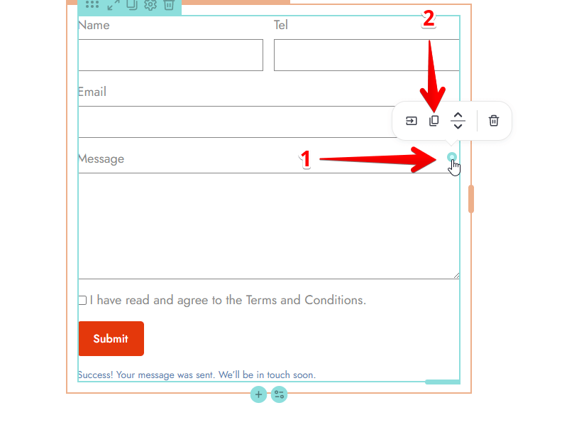
Duplicating Fields : Click the icon in the top-right corner of an individual field and click the Copy icon to duplicate or copy a field.
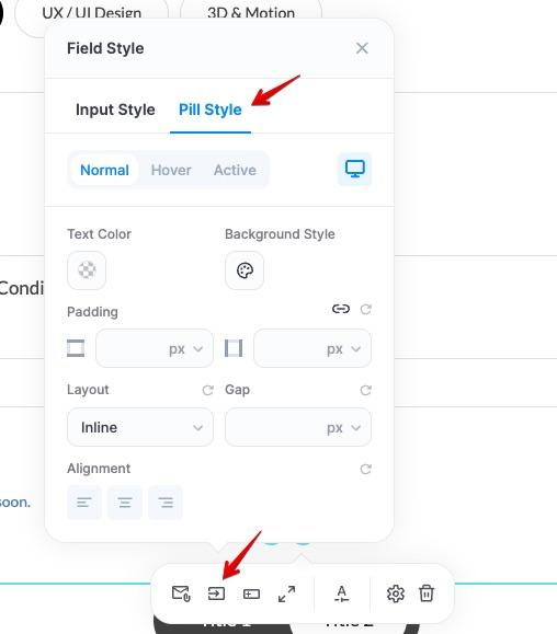
Pill Style for Checkboxes & Radio Buttons
Checkbox and Radio Button fields can be displayed as pills instead of the standard list. Open the field’s settings and, in the Display Style dropdown, choose Pill. Your options then render as rounded, tappable buttons — ideal for topic pickers, budget ranges, and other multiple-choice questions.
When Display Style is set to Pill, a new Pill Style tab appears in the Field Style panel (next to Input Style). Open the field’s style settings from the field toolbar to customize:
- Normal / Hover / Active states
- Text Color and Background Style
- Padding, Layout (Inline), and Gap between pills
- Alignment
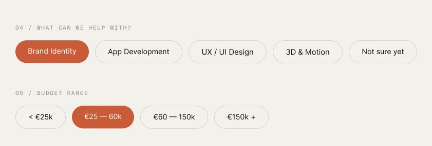
On the front end, the selected pill is highlighted with your active color:
General Styling (Sidebar)
The sidebar panel provides global design controls to ensure your contact form maintains a consistent look and feel across all device types.
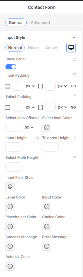
Input Style
Fine-tune the appearance of the form's data entry fields:
-
State Selection: Customize different styles for Normal, Hover, and Active interaction states.
-
Labels: Use the Show Label toggle to display or hide field titles.
-
Field Dimensions: Set specific values for Input Height, Textarea Height, and Select Multi Height.
-
Internal Padding: Independently adjust the Input Padding and Select Padding for all four sides.
-
Select Icons: Customize the Select Icon Offset and Select Icon Color for dropdown fields.
-
Color Configuration: Access individual color pickers for the Label, Input text, Placeholder text, Choice items, Asterisk, and system-generated Success/Error Messages.
-
Advanced Field Style: Click the Input Field Style icon to apply custom Color, Border, and Shadow properties to the input containers.
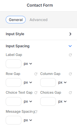
Input Spacing
Control the breathing room between different form elements:
-
Label Gap: Adjust the distance between the label text and the input field.
-
Grid Spacing: Set the Row Gap and Column Gap to organize fields in multi-column layouts.
-
Choice Spacing: Fine-tune the Choice Text Gap and the overall Choices Gap for radio buttons or checkboxes.
-
Message Spacing: Control the margin around form feedback messages.
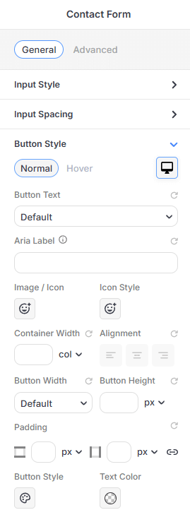
Button Style
Style the primary "Submit" or action button:
-
Content: Edit the Button Text and provide an Aria Label for improved accessibility.
-
Icons: Add an Image/Icon and customize its Icon Style.
-
Layout: Set the Container Width and choose an Alignment (Left, Center, Right).
-
Dimensions: Customize Button Width, Button Height, and internal Padding.
-
Visuals: Set unique Text Colors and access the Button Style icon to apply custom Color, Border, and Shadow properties to the button.
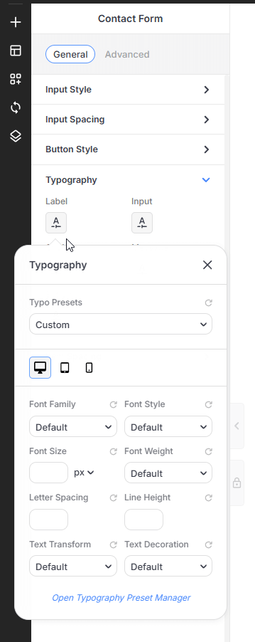
Typography & Item Spacing
-
Typography Presets: Assign independent font styles for the Label, Input, Choice, Message, and Button elements.
-
Global Layout: Adjust the overall Padding and Margin for the entire form element.
Advanced Configuration (Gear Icon)
Click the settings (gear) icon on the form element to access advanced backend functionality:
-
Email Settings: Configure the Subject, Email To, From Name, and Reply To addresses. You can also choose the email Type (e.g., Plain Text or HTML).
-
Custom Message: Enable this option to receive a custom message in your email. Use Shortcodes from the form fields to get the relevant information.
-
Apps (Integrations): Enable and manage API keys for third-party services like Mailchimp and Active Campaign, with more integrations currently in development.
For more detailed information on setting up these connections, please refer to the Newsletter Form & Integration guide. -
reCAPTCHA: Toggle Turn reCAPTCHA On to protect your form from spam.
-
Messages: Customize the feedback text shown to users, including the Success Message, Wrong Format Warning, and Server Error Message.
Server Configuration: Please ensure your server is correctly configured to send emails. If your emails are not being delivered, you may need to use a dedicated SMTP plugin to handle email transmission.