Container & Column Elements
This panel gives you all the essential tools to structure your layout using Containers and Columns. Here's what each option does:
Add Container
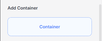
Container
The main building block used to hold content. A container can include columns, or any other elements. It helps manage spacing, alignment, and background styling.
General Tab
The General tab in the Container settings lets you control the layout, spacing, and alignment of the content inside the container. It includes two main sections: Width & Height and Alignment.
Width & Height
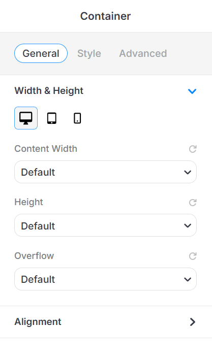
This section helps you control the overall size of your container.
-
Device View Tabs
Switch between Desktop, Tablet, and Mobile to set responsive values. -
Content Width
Controls how wide the content inside your container should be.-
Default – Uses the theme’s default container width.
-
Full Width – Stretches the container across the full width of the screen.
-
Boxed Width – Keeps your content inside a boxed area with padding on the sides.
-
-
Height
Sets how tall your container will be.-
Default – Uses the default height based on your content.
-
Auto – Automatically adjusts height based on content size.
-
Min Height – Sets a minimum height that the container must have.
-
Full Screen – Makes the container fill the entire height of the screen.
-
-
Overflow
Controls what happens if the content inside the container is too big.-
Default – Uses the default overflow behavior.
-
Visible – Shows any overflowing content.
-
Hidden – Hides anything that goes outside the container.
-
Scroll – Adds a scroll bar to view the extra content.
-
Auto – Scrolls only if needed, depending on content size.
-
Alignment
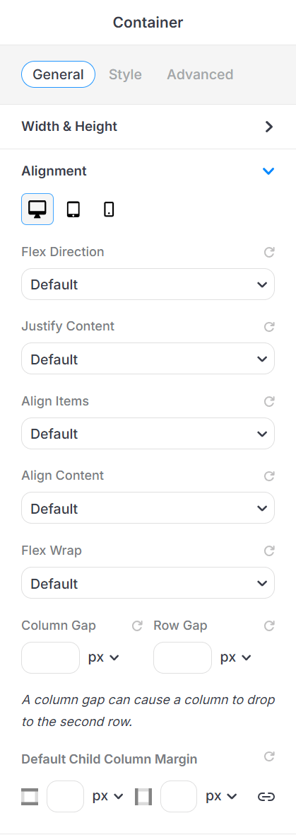
This section uses Flexbox settings to arrange child elements (like columns or items) inside the container.
-
Flex Direction: Set layout direction (row or column).
-
Justify Content: Align items horizontally (e.g., left, center, space between).
-
Align Items: Align items vertically (e.g., top, center, bottom).
-
Align Content: Controls multi-line alignment (when wrapping occurs).
-
Flex Wrap: Decide whether items stay in one line or wrap to the next.
Spacing Options:
-
Column Gap: Horizontal spacing between columns.
-
Row Gap: Vertical spacing between rows.
-
Default Child Column Margin: Set default margins for all columns inside this container (top, bottom, left, right).
Style Tab
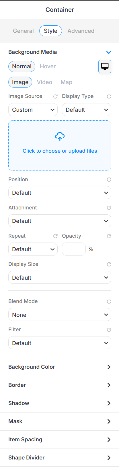
The Style tab allows you to customize the look and feel of your container, from background images to spacing, borders, shadows, and more. This is where you make your container visually appealing.
- Background Media: Add an image, video or Google Map as the background.
-
Background Color: Choose a solid color or gradient.
-
Border: Set border style, color, and radius (rounded corners).
-
Shadow: Add drop shadows to give depth.
-
Mask: Apply shape overlays to your container.
-
Item Spacing: Adjust spacing between child elements inside the container.
-
Shape Divider: Add decorative dividers (top or bottom) for stylish section transitions.
Advanced Tab
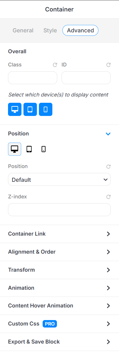
This Advanced tab in the Container element of PixeBuilder lets you fine-tune how a container behaves and interacts on your page, great for custom styling, animations, and layout control.
-
Class & ID: Add custom CSS classes or IDs for advanced styling.
-
Device Visibility: Choose which devices (desktop, tablet, mobile) the container is shown on.
-
Position: Adjust the position of the container (e.g., relative, absolute).
Container Link: The panel allows us to configure a hyperlink for a container element.
-
Alignment & Order: Change how the container aligns and its position in a flex layout.
-
Transform: Apply scale, rotate, or offset and skew value.
-
Animation: Add entrance or scroll-based animations.
-
Content Hover Animation: Set hover effects for interactive styling.
Custom CSS (PRO): Apply your own custom CSS rules (available in Pro version).
-
Export & Save Block: Export the current block settings or save for reuse.
-
Propagate Hover Color: Applies hover color only to child elements that support hover color styling — hovering the container switches all supported child elements from their normal color to their hover color together.