Follow these steps to create a professional side-drawer cart popup for your WordPress store.
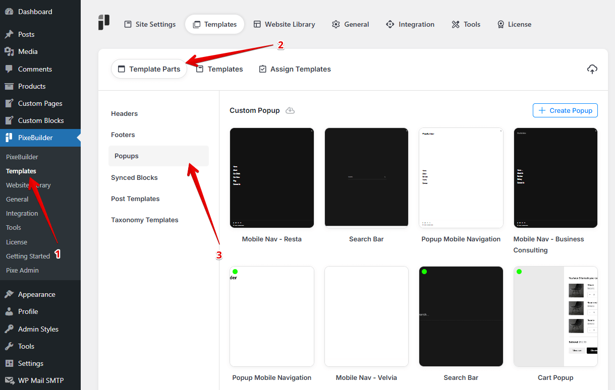
Step 1: Create the Popup Template
- Navigate to PixeBuilder > Templates > Template Parts.
- Select the Popups tab on the left sidebar.
- Click the + Create Popup button.
- Give your popup a recognizable title, such as "Popup Side Cart".
Step 2: Configure Global Popup Styles
Before adding the cart content, set up the container and behavior:
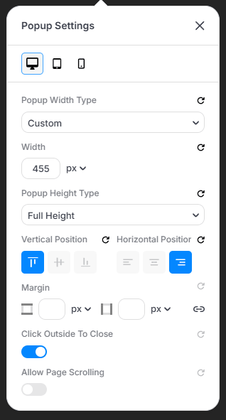
- Popup Settings: Set Width Type to "Custom" (approx. 455px) and Height Type to Full Height. Under Horizontal Position, select the Right alignment icon to create the side-drawer effect. Enable Click Outside To Close.
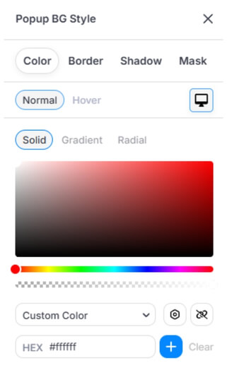
- Popup BG Style: Choose your background color (e.g., solid white #ffffff).
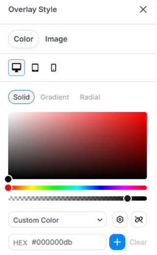
- Overlay Style: Set a dark overlay color (e.g., #000000db) to dim the background content when the cart is active.
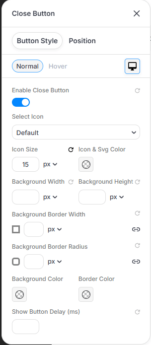
- Close Button: Enable the toggle. Customize the Icon Size (e.g., 15px) and positioning so users can easily exit.
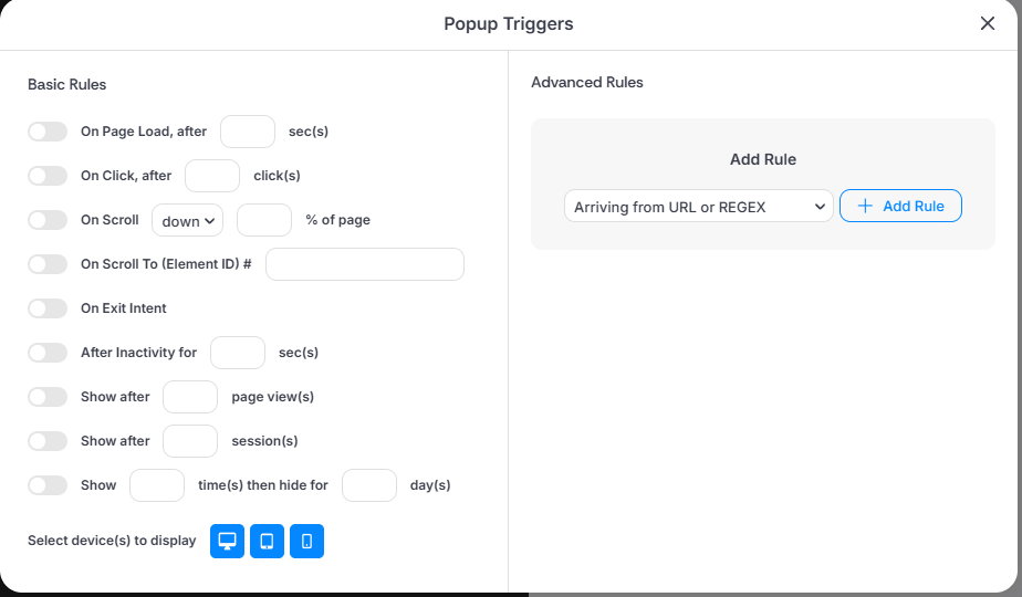
- Triggers: For a cart popup, you typically do not need auto-triggers; it will be activated manually by the header icon.
Step 3: Building the Layout
-
In the Pixe Builder editor.
-
Search for and add the Cart Popup element into your popup container.
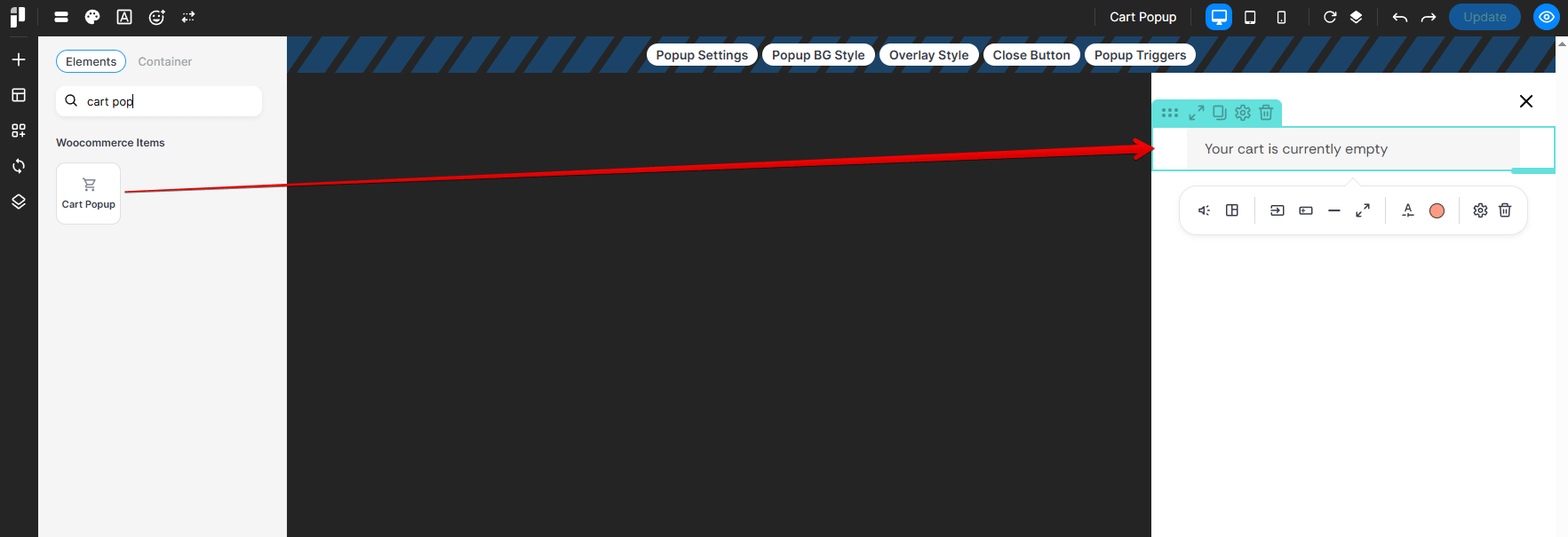
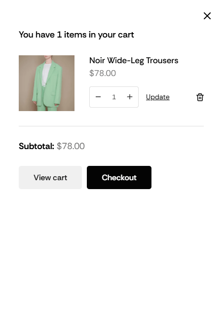
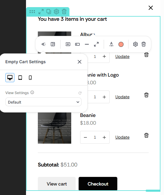
The Cart Popup element allows you to customize both the active cart and the empty state by adjusting the View Settings.
Under Empty Cart Settings, use the View Settings dropdown to toggle between styles:
- Default View: style the appearance of the cart when it contains items (product list, subtotal, and buttons).
- Empty Cart View: style the message that appears when the cart is empty.
Step 4: Other Cart Element Settings
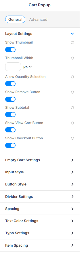
In the General tab of the Cart Popup element, configure the Layout Settings:
- Show Thumbnail: Enable to display product images.
- Thumbnail Width: Define a specific pixel width for product images if needed.
- Allow Quantity Selection: Enable so users can change item counts directly in the popup.
- Show Remove Button: Enable the trash icon for easy item removal.
- Show Subtotal: Display the total cost before shipping/taxes.
- Show View Cart & Checkout Buttons: Enable both to provide clear calls to action.
- Additional Styling: Use the Empty Cart Settings, Input Style, and Button Style tabs to customize the appearance.
Step 5: Link the Popup to Your Header
Now, connect the popup to your site's navigation:
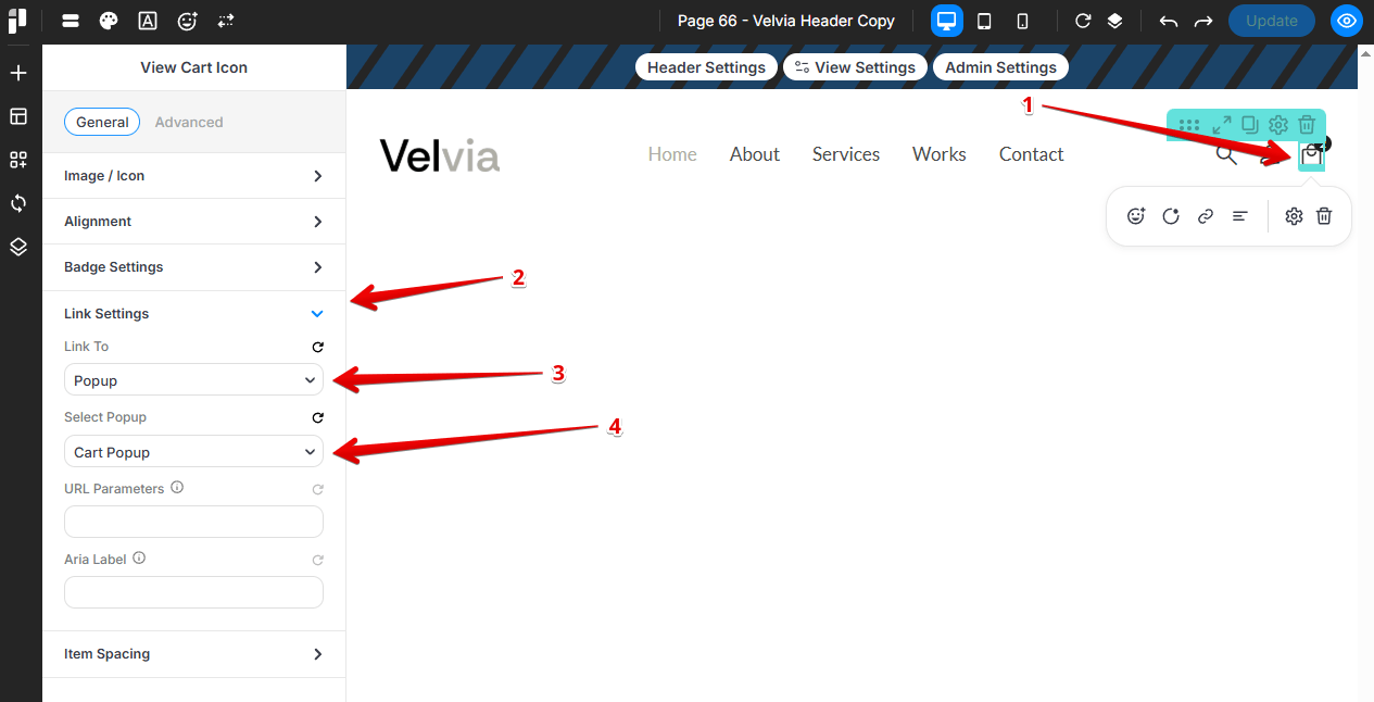
- Go to PixeBuilder > Templates > Template Parts > Headers.
- Select and edit your active header.
- Click on the View Cart Icon element in the header.
- In the left panel, go to Link Settings:
- Link To: Select Popup.
- Select Popup: Choose Cart Popup (or the title you created in Step 1) from the dropdown.
Step 6: The Result
Once saved, clicking the cart icon in your header will trigger the side-drawer. Users will see a clean, organized list of their items, the subtotal, and direct buttons to View Cart or Checkout without leaving the current page.