
The Dark Mode Toggle lets visitors switch your site between light and dark appearance. Drop it anywhere — most commonly in your header — and PixeBuilder handles storing the visitor's choice and applying the dark palette across the page.
Before you start: the toggle only switches between palettes — it doesn't create them. Your dark colors are defined in the Variable Manager, under Colors, where every color variable has separate Light and Dark values (or can be marked Dark Only). This is the only place light/dark colors are set. If an element uses a fixed color instead of a color variable, it will look the same in both modes.
Adding the toggle
- Click the add element (+) icon on the left rail to open the Elements panel.
- In Basic Elements, drag Dark Mode Toggle onto your page, header, or footer.
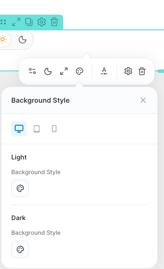
- Click the element's colored dot to open its toolbar — the settings icon opens the Dark Mode Toggle panel, the moon icon opens Toggle Style, and the palette icon opens Background Style.
Toggle settings
Click the settings icon on the element's toolbar to open the Dark Mode Toggle panel.
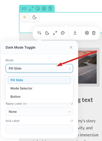
Mode — how the toggle is presented:
- Pill Slide — a rounded pill with a sun and moon icon; the indicator slides between them.
- Mode Selector — a compact selector for choosing the mode.
- Button — a single button that flips between states.
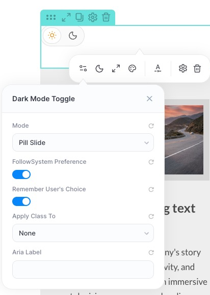
- Follow System Preference — on first visit, match the visitor's OS/browser light-or-dark setting.
- Remember User's Choice — keep the visitor's selection on later visits and across pages. A manual choice overrides the system preference.
- Apply Class To — optional, for custom CSS. The toggle always adds a pixe-dark-mode class to the page's <html> element, which is what switches your Variable Manager colors — this happens regardless of this setting. Choosing Body or HTML here additionally applies a class name you choose to that element, revealing two more fields: Class Name for Dark Mode and Class Name for Light Mode. This is useful if your theme or custom stylesheet expects its own dark-mode class (for example a Tailwind-style dark class on <body>). Leave it as None unless you need this.
- Aria Label — accessible name announced by screen readers, e.g. "Toggle dark mode". Recommended, since the control is icon-only.
Toggle Style — Settings
Open the moon icon in the element's toolbar, then the Settings tab, to size the toggle per device (Desktop / Tablet / Mobile):
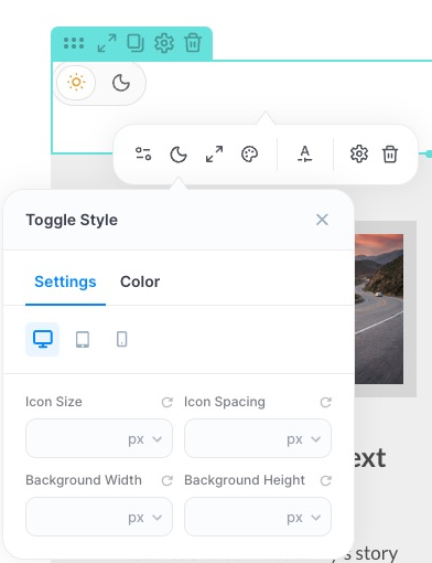
- Icon Size
- Icon Spacing
- Background Width
- Background Height
Toggle Style — Color
Switch to the Color tab to style the toggle's icon, text, and background. Colors are split into Normal and Active states, and each state has separate Light and Dark sections — so you control how the toggle itself looks in both modes:
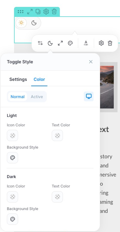
- Icon Color
- Text Color
- Background Style
Pick from your color variables so the toggle stays in step with the rest of your palette.
Background Style
The palette icon on the toolbar opens a dedicated Background Style panel for the space behind the toggle — again per device, with separate Light and Dark values.
How the rest of the page turns dark
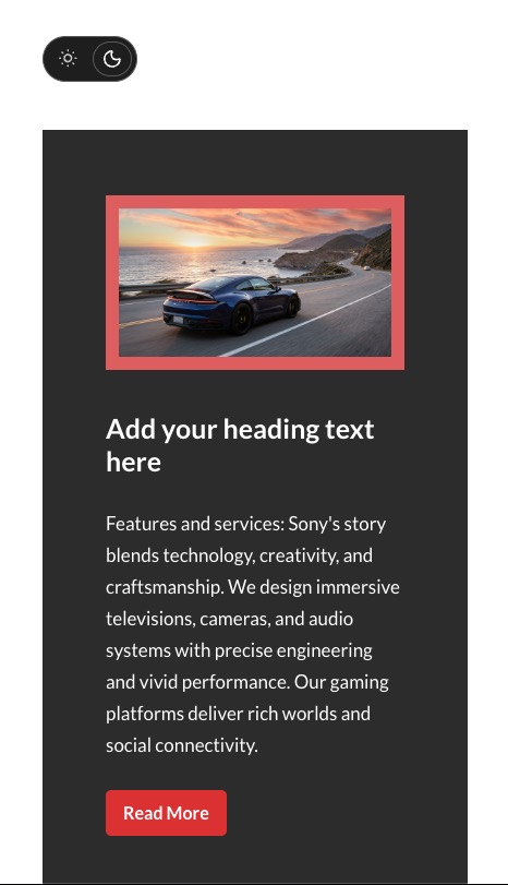
When a visitor switches the toggle, PixeBuilder swaps every color variable on the page to its Dark value. So:
- Build with color variables (Variable Manager → Colors), not fixed colors.
- Set the Dark value for each variable as you create it.
- Anything hardcoded — a fixed background color, a baked-in image — stays the same in both modes.
Tip: test with Follow System Preference enabled and your OS set to dark mode to catch any elements that were styled with fixed colors instead of variables.