The Variable Manager is PixeBuilder’s central place to define reusable design values — colors, spacing, fonts, radii, shadows, and numbers — once, then use them anywhere on your site. Change a variable in one place and every element that uses it updates instantly.
Think of variables as your site’s design system: a single source of truth that keeps your design consistent and turns site-wide changes, like rebranding a color or adjusting spacing, into a one-click job. Every variable is saved as a standard CSS custom property (for example --primary or --space), shown in the live code preview as you edit.
Opening the Variable Manager
Open the Variable Manager from the hexagon icon in the editor’s top toolbar (highlighted below).
You can also open it on the fly from any value control that supports variables — switch to the Variables tab and click the Variable Manager button (shown later in this guide).
The Variable Manager layout
The Variable Manager is organized into three columns:
- Left — Categories: Colors, Spacing, Typography, Radius, Shadow, and Numbers.
- Middle — Variable list: a searchable list of every variable in the selected category, each with a live value preview. Use Search variable… to filter.
- Right — Editor: the controls for the selected variable. The icons at the top-right let you duplicate, rename, or delete it.
To create a new variable, type a name in the Add Variable field at the bottom and click Create Variable.
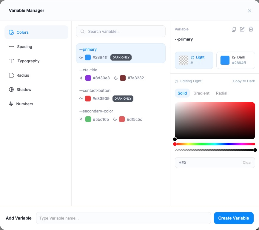
Colors
Color variables support separate Light and Dark mode values — set a different color for each, or mark a variable Dark Only. Each color can be Solid, Gradient, or Radial, and you can enter an exact HEX value.
Example variables: --primary, --secondary-color, --cta-title, and --contact-button.
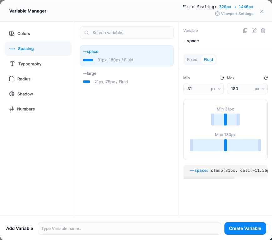
Spacing
Spacing variables can be Fixed (a single value) or Fluid (responsive). Fluid spacing scales smoothly between a Min and Max value across your viewport range — shown at the top as Fluid Scaling: 320px → 1440px and adjustable via Viewport Settings. PixeBuilder generates the clamp() CSS for you automatically.
Example: --space scales 31px–180px; --large scales 21px–75px.
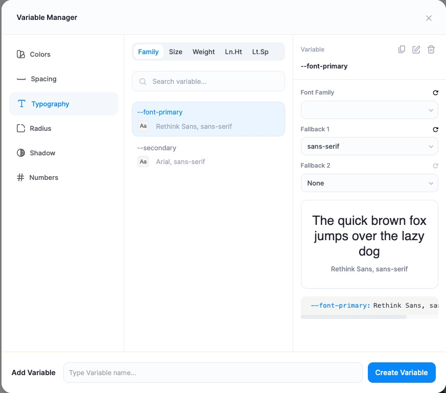
Typography
Typography variables are split into sub-tabs: Family, Size, Weight, Ln.Ht (line height), and Lt.Sp (letter spacing). For a font family you set a primary Font Family plus Fallback 1 and Fallback 2, with a live preview.
Example: --font-primary (Rethink Sans, sans-serif) and --secondary (Arial, sans-serif).
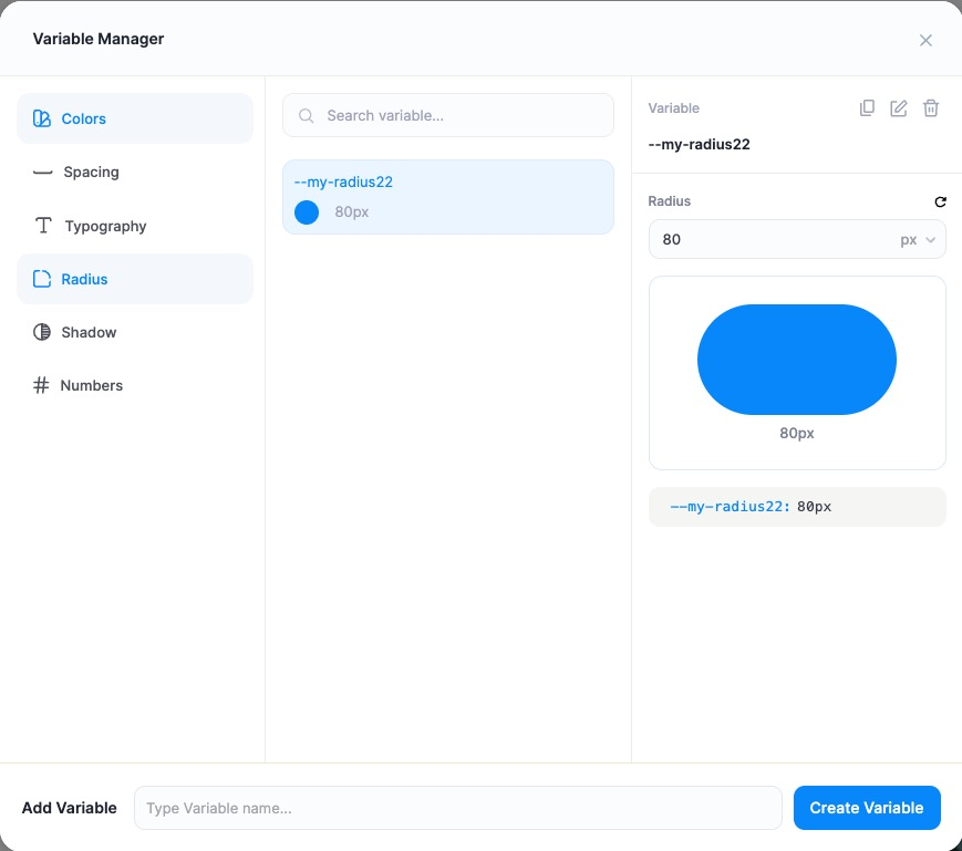
Radius
Radius variables store a single corner-radius value with a live rounded-shape preview — handy for keeping buttons, cards, and images consistently rounded.
Example: --my-radius22 set to 80px.
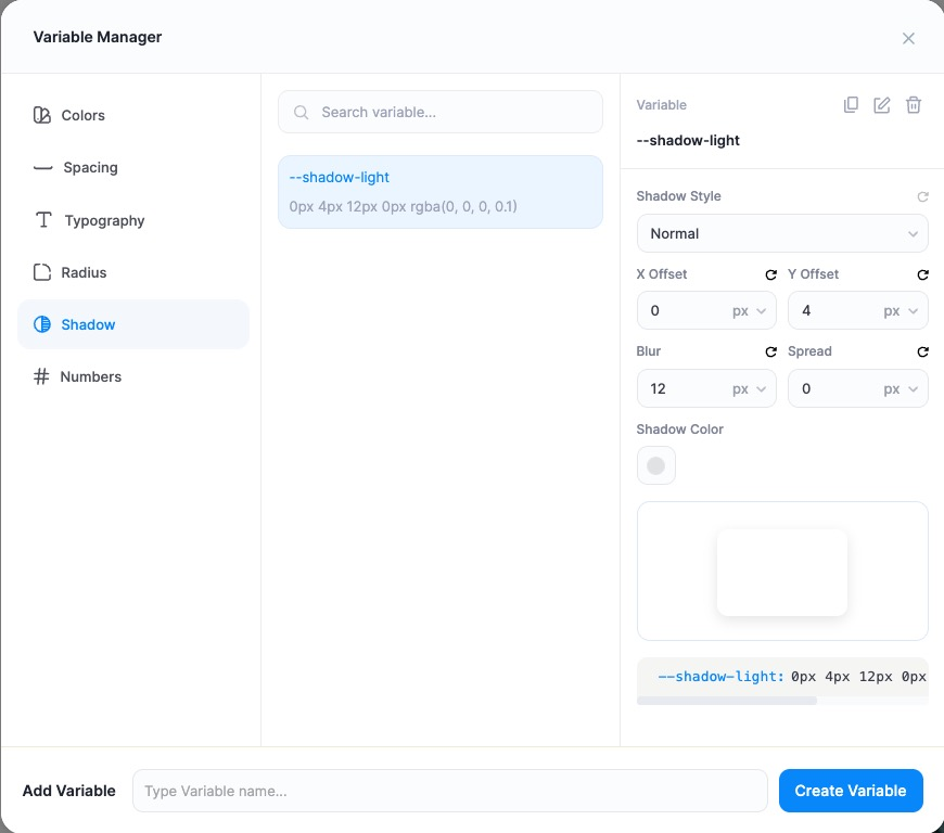
Shadow
Shadow variables build a box-shadow from X Offset, Y Offset, Blur, Spread, and Shadow Color, with a Shadow Style option and a live preview.
Example: --shadow-light = 0px 4px 12px 0px rgba(0, 0, 0, 0.1).
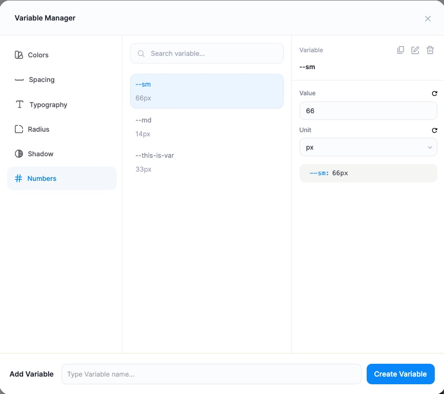
Numbers
Numbers are general-purpose variables — a Value plus a Unit (such as px) — for anything that doesn’t fit the other categories.
Example: --sm (66px), --md (14px), --this-is-var (33px).
Using variables on your elements
Once defined, your variables appear inside the value controls throughout the editor.
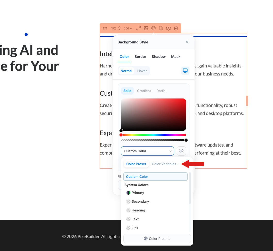
Colors: In a Background Style → Color panel, open the color dropdown and switch to the Color Variables tab to pick one of your defined colors (alongside the built-in System Colors: Primary, Secondary, Heading, Text, and Link).
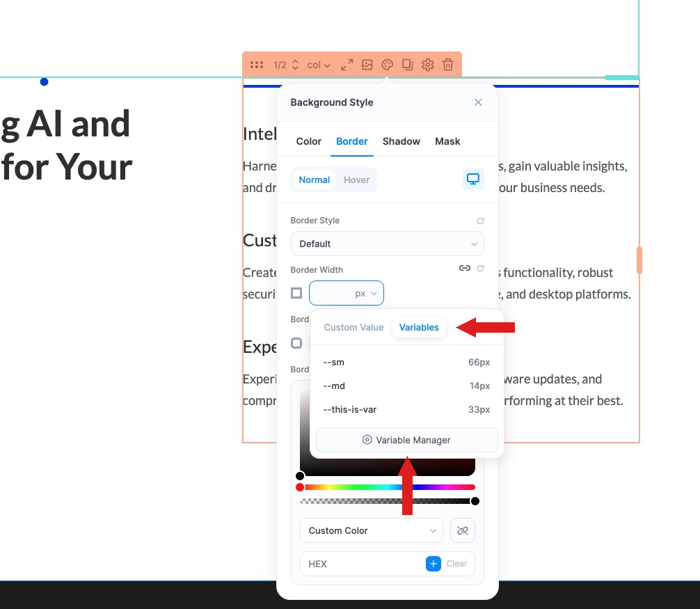
Sizes, spacing & borders: In fields like Border Width, switch to the Variables tab and choose a variable from the list. The Variable Manager button there opens the full manager directly.
Because each element references the variable rather than a fixed value, updating the variable in the Variable Manager instantly updates every element that uses it.
Tips
- Name variables by purpose, not value (for example --cta-button rather than --red) so they still make sense after a redesign.
- Use Fluid spacing for padding and margins that should adapt across screen sizes without manual breakpoints.
- Set Dark mode colors up front so your site is dark-mode ready as you build.