The WP Menu element in PixeBuilder allows you to seamlessly integrate standard WordPress menus into your custom layouts. This element provides extensive styling controls to transform basic WordPress lists into professional navigation bars with advanced hover effects, animations, and responsive behaviors.
Pre-requisite: Creating a Menu in WordPress
Before using the WP Menu element, you must have a menu created within the WordPress core settings.
-
Navigate to Appearance > Menus in your WordPress dashboard.
-
Click Create a new menu, give it a name, and click Create Menu.
-
Select pages, posts, or custom links from the left column and click Add to Menu.
-
Organize your items by dragging them into place. Create sub-menus by nesting items underneath a parent link.
-
Click Save Menu.
Selecting Your Menu
Once your menu is ready, add the WP Menu element to your PixeBuilder page.
-
Select Menu: In the Main settings tab, choose the specific WordPress menu you want to display from the dropdown list.
Menu Style: Choose between a Vertical or Horizontal style for your menu.
-
Alignment: Set the alignment of your menu items and the menu text to Left, Center, or Right.
-
Sub-menu Position: Select a Bottom/Top(Horizontal) or Left/Right/Dropdown(Vertical) position for the sub-menus.
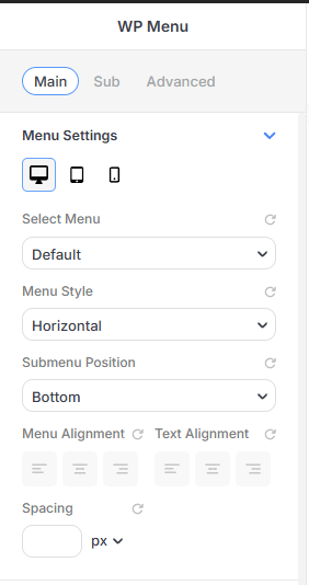
Main Menu Settings
This tab handles core selection and basic structural layout:
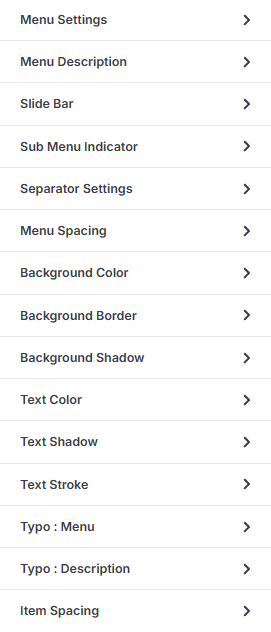
Menu Description
Enable Description: Toggle this to show the description text under menu titles.
-
Description Color: Set the text color for the description
-
Description Space: Adjust the margin between the menu title and its description.
Slide Bar Indicator (Hover Effect)
This feature adds a dynamic moving line or bar that follows the user's cursor:
-
Enable Slide Indicator: Toggle this to activate the animated selection bar.
-
Indicator Style: Choose from Solid Color, Gradient, or Radial fills.
-
Indicator Width & Height: Set the dimensions of the bar in pixels.
-
Border Radius: Create rounded edges for the slide bar.
Sub Menu Indicator
-
Enable/Disable Toggle: You can turn the indicator on or off for parent menu items.
-
Indicator Icon: Select a specific icon to represent the dropdown from the available icon library.
-
Icon Size & Color: Adjust the dimensions of the indicator icon in pixels (px) using a slider or numerical input and its color.
-
Indicator Position: Define where the icon appears relative to the menu text, with options for Left, or Right.
-
Indicator Space: Set a specific pixel value to control the distance between the menu item text and the indicator icon.
Offset Y Axis: Set a specific or % value to control the distance between the top of the menu and the indicator icon.
Separator Settings
-
Enable Separator: A toggle switch to turn the dividers on or off for the entire menu.
-
Width & Height: Set specific values to control the thickness and length of the separator line.
Offset Y Axis: Set a specific or % value to control the distance between the top of the menu and the separator.
-
Border Radius: Soften the edges of the separator by applying rounded corners.
-
Separator Color: Select a solid color, gradient, or radial fill for the divider using the color picker.
Spacing, Background & Borders
Spacing: Adjust the spacing around each menu link to define the size of the clickable area.
Background Style: Apply colors, gradients, or masks to the menu item background.
-
Border & Radius: Add outlines or rounded corners to individual menu items.
-
Shadow: Apply an Outer Shadow or Inner Shadow to create depth during hover or active states.
Typography
-
Typo Settings: Customize the font family, size, weight, and letter spacing for your menu text and description.
Sub Menu Settings
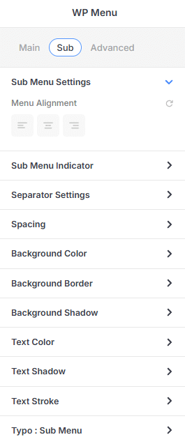
The Sub Settings tab allows you to configure the appearance and behavior of nested menu items. Many of the styling and configuration options in this section are the same as or similar to the Main Menu options, providing a consistent design experience across all levels of your navigation.
Advanced Settings
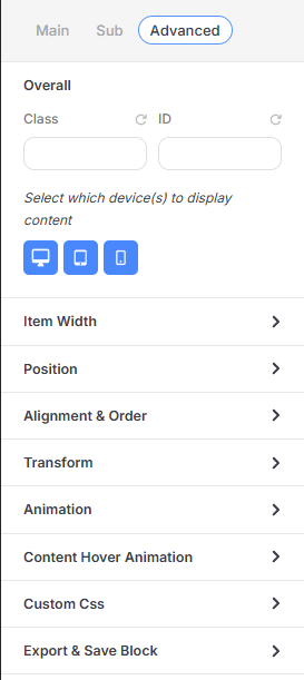
This section provides high-level technical controls:
CSS selectors: Assign an ID or a Class to this element and use it to customize the element using custom CSS.
-
Responsive Visibility: Use the Device Toggle to show/hide the menu on Desktop, Tablet, or Mobile.
Item Width: Control the width and max-width of this element.
Position: Choose between Relative(default), Absolute and Fixed styles for this element.
-
Alignment & Order: Manage Flexbox properties like Align Self, Flex Basis, and Flex Order.
-
Transform: Rotate, scale, or skew the menu on X and Y axes.
-
Animation: Apply entrance effects with custom Duration, Delay, and Looping.
Content Hover Animation: Apply animation effects when the element in hovered upon.
-
Custom CSS: An editor for applying unique CSS directly to the element.
-
Export & Save Block: Save the styled menu as a Custom Block or export as a .json file.
Menu Setup: Individual Item & Sub-Menu Customization
In addition to global settings, PixeBuilder allows for granular customization of individual menu items and their associated sub-menus. This is achieved by selecting specific items within the builder interface to reveal dedicated settings panels.
Individual Main Menu Item Customization
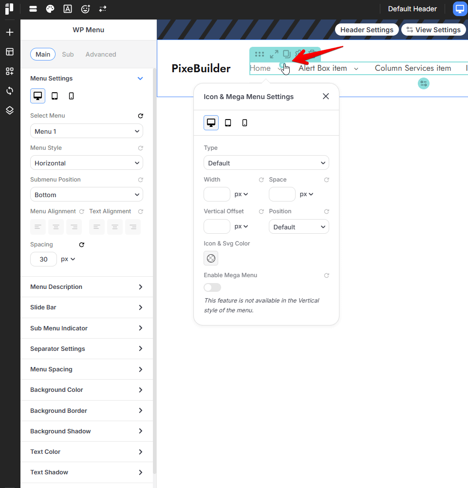
When a main menu item is selected, you can access the Icon & Mega Menu Settings to define unique visual markers or expand the item into a complex layout.
-
Icon Settings: * Type: Choose the default display type for the icon.
-
Dimensions & Spacing: Set the Width, Space, and Vertical Offset in pixels (px).
-
Position: Define the icon's placement relative to the menu text.
-
Icon & Svg Color: Select a specific color for the item's icon.
-
-
Mega Menu: * Enable Mega Menu: A toggle to transform the standard dropdown into a wide "Mega Menu" layout.
-
Note: This feature is currently only available for the Horizontal menu style.
-
Sub-Menu Specific Customization
Sub-menus can be styled independently of the main navigation to ensure clarity and visual hierarchy.
-
Layout & Alignment:
-
Menu Alignment: Set the horizontal alignment (Left, Center, Right) specifically for the sub-menu items.
-
-
Sub Indicator Styles:
-
Enable Sub Indicator: Toggle a unique icon for nested sub-menu items.
-
Customization: Select a Sub Indicator Icon, set the Icon Size, choose an Icon & Svg Color, and define its Position and Offset Y Axis.
-
- Separators:
- Enable Separator: Enable a visual dividers between sub-menu items and control its dimensions, color and position.
- Submenu Spacing: Control the Submenu Padding, Submenu Item Padding, and Submenu Margin to refine the internal and external layout.
-
Visual Styling:
-
Background Style: Fully customize the sub-menu container with specific Color (Solid, Gradient, Radial), Border, and Shadow settings.
-
Typography: Set independent Typo Presets, Font Family, Font Size, Weight, Line Height, and Letter Spacing for sub-menu text.
-
Text Color Settings: Define unique colors for Normal, Hover, and Active states, with additional options for text Shadow and Stroke.
-
Mega Menu
The Mega Menu feature in PixeBuilder transforms standard dropdown sub-menus into highly customizable, wide-format containers. This allows you to move beyond simple link lists and build complex layouts using standard PixeBuilder elements directly within your navigation.
Enabling the Mega Menu
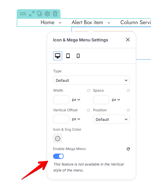
To activate a mega menu for a specific navigation branch, you must enable it at the parent level:
-
Select a Parent menu item within the builder interface to open the Icon & Mega Menu Settings panel.
-
Locate the Enable Mega Menu toggle at the bottom of the settings.
-
Once checked, the standard sub-menu is replaced by a customizable Mega Menu Container.
Note: The Mega Menu feature is currently only compatible with the Horizontal menu style; it is not available for menus using the Vertical style.
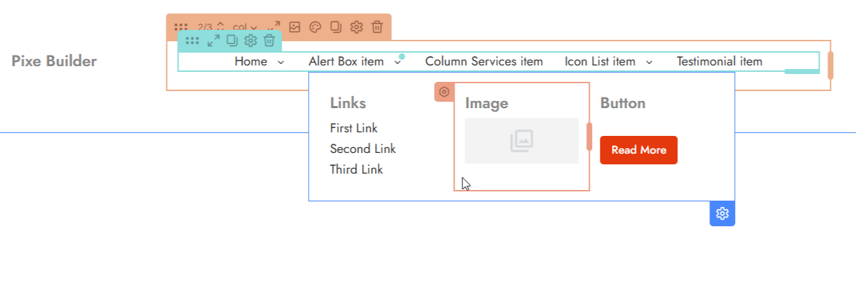
Building Your Layout
Inside the mega menu container, you can drag and drop standard PixeBuilder elements to create a rich browsing experience:
-
Structural Elements: Add Columns to organize content into grids.
-
Media & Text: Insert Images, Text blocks, and Buttons to highlight promotions or featured categories.
-
Interactive Links: Use Links and custom menus to guide users to specific site sections.
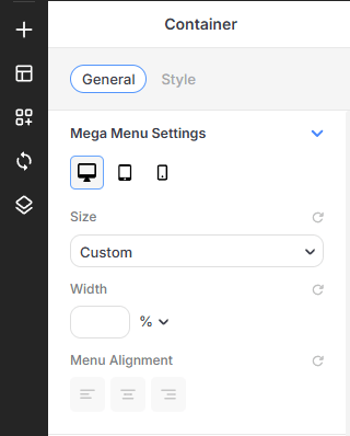
Container Settings and Styling
The mega menu container functions similarly to other container elements in PixeBuilder, offering extensive design control.
-
Size & Alignment:
-
Width: Set a Custom Width for the mega menu as a percentage (%) of the screen or container.
-
Menu Alignment: Choose the horizontal alignment of the content within the container.
-
-
Background Styling:
-
Background Color: Apply a Solid, Gradient, or Radial color to the entire mega menu area.
-
Background Media: Upload an Image to use as the container's backdrop, with controls for position, attachment (e.g., Fixed), and opacity.
-
-
Advanced Visuals:
-
Border & Shadow: Add custom Borders and Shadows (inner or outer) to create depth and separation from the main page content.
-
Spacing: Fine-tune the Padding and Margin to ensure your layout has the correct internal breathing room and external placement.
-