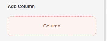
Add Column
Column
Used to divide space within a container. You can insert text, images, buttons, or any other elements into a column to organize your content efficiently.
Add Preset Layouts
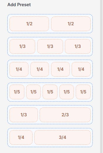
Under the Add Preset section, you can quickly insert predefined column structures inside a container. These presets help streamline layout creation and ensure a responsive design without manual configuration.
1/2 + 1/2 – A classic 50/50 split, perfect for text-image sections or dual features.
1/3 + 1/3 + 1/3 – Balanced layout often used for service features or pricing plans.
1/4 + 1/4 + 1/4 + 1/4 – Great for grids, icon boxes, or short highlights.
1/5 + 1/5 + 1/5 + 1/5 + 1/5 – Ideal for showcasing multiple logos, features, or links in compact form.
1/3 + 2/3 – A flexible split that works well for highlighting primary content alongside secondary details.
1/4 + 3/4 – Useful for sidebars or menus paired with a large content area.
Column settings
The Column Settings panel in PixeBuilder gives you full control over how each column looks and behaves across devices. It includes 3 main tabs:
-
General: Adjust width, height, content size, overflow, and alignment. Easily set responsive layouts for desktop, tablet, and mobile.
-
Style: Customize the background, borders, shadows, spacing, and more to style your column visually.
-
Advanced: Add custom CSS classes/IDs, set responsive visibility, apply animations, transform effects, and advanced layout tweaks.
General Tab
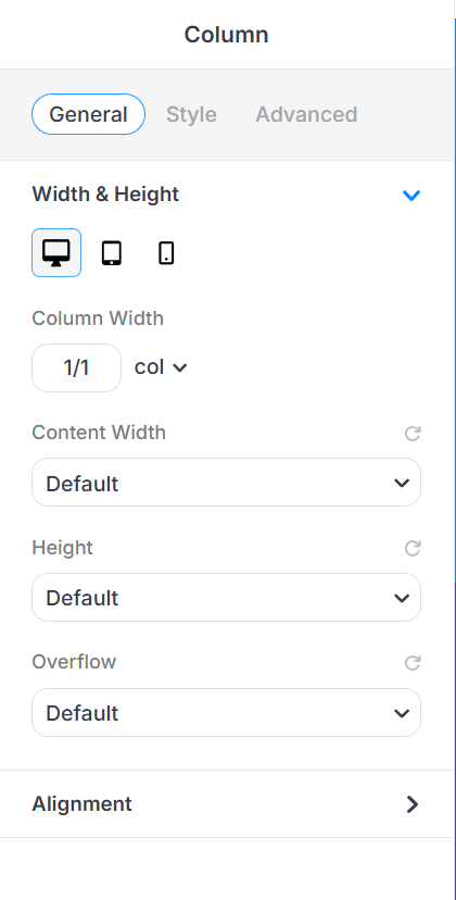
This section helps you control the overall size of your column.
-
Device View Tabs: Switch between Desktop, Tablet, and Mobile to set responsive values.
-
Content Width
Controls how wide the content inside your column should be.
-
Default – Uses the theme’s default container width.
-
Full Width – Stretches the container across the full width of the screen.
-
Boxed Width – Keeps your content inside a boxed area with padding on the sides.
-
-
Height
Sets how tall your column will be.
-
Default – Uses the default height based on your content.
-
Auto – Automatically adjusts height based on content size.
-
Min Height – Sets a minimum height that the container must have.
-
Full Screen – Makes the container fill the entire height of the screen.
-
-
Overflow
Controls what happens if the content inside the column is too big.
-
Default – Uses the default overflow behavior.
-
Visible – Shows any overflowing content.
-
Hidden – Hides anything that goes outside the container.
-
Scroll – Adds a scroll bar to view the extra content.
-
Auto – Scrolls only if needed, depending on content size.
- The Alignment panel displays device-specific controls (desktop, tablet, mobile) and provides options for Flex Direction, Justify Content, Align Items, Align Content, and Flex Wrap, along with input fields for Column Gap and Row Gap measured in pixels.
Style Tab
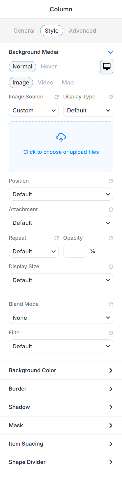
- Background Media: Add background visuals to your column.
- Background Color: Set a solid color behind your column.
- Border: Add borders with custom width, style, and color.
- Shadow: Apply shadow effects for depth.
- Mask: When you select a shape as the mask, it will be applied to the background media and reshape the entire column area background.
- Item Spacing: Adjust padding and margin inside/outside the column.
- Shape Divider: Add decorative shapes to the top or bottom of the column.
Advanced Tab
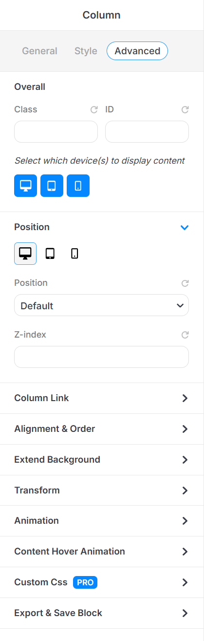
Overall
-
Class & ID: Add custom CSS class or ID for advanced styling (great for developers or custom design tweaks).
-
Device Visibility: Choose which devices (desktop, tablet, mobile) the column should appear on.
Position
-
Set the position type (static, relative, absolute, fixed, etc.) for advanced layout control.
-
Use Z-index to layer the column above or below other elements.
Other Controls
-
Column Link: Turn the entire column into a clickable link.
-
Alignment & Order:
-
Align Self: Controls how this individual item aligns along the cross-axis, overriding the container’s align-items setting.
Flex Basis: Sets the initial size of the item before free space is distributed, defining its starting width or height in the flex layout.
Flex Grow: Determines how much the item expands relative to other items when extra space is available.
Flex Shrink: Determines how much the item reduces in size relative to others when space is limited.
Flex Order: Sets the visual order of the item within the flex container without changing the actual HTML structure.
-
-
Extend Background: Stretch the background beyond the column’s padding.
-
Transform: Apply scaling, rotation, or movement effects.
- Animation: Add animation effect, duration, delay, trigger location, and an option to enable loop animation.
- Content Hover Animation: Set hover effects for interactive styling.
-
Custom CSS (Pro): Add custom CSS directly if you have coding skills.
-
Export & Save Block: Save this column as a reusable block.
-
Propagate Hover Color: Applies hover color only to child elements that support hover color styling — hovering the column switches all supported child elements from their normal color to their hover color together.