Creating a dedicated mobile navigation system in PixeBuilder ensures a seamless browsing experience for users on smaller screens.
This guide will walk you through creating a dedicated mobile menu using a combination of a device-specific container, a Hamburger Button, and the Popup Builder.
Creating the Mobile Navigation Container
To keep your desktop and mobile headers organized, you should hide the desktop header on handheld devices and create a dedicated container for them.
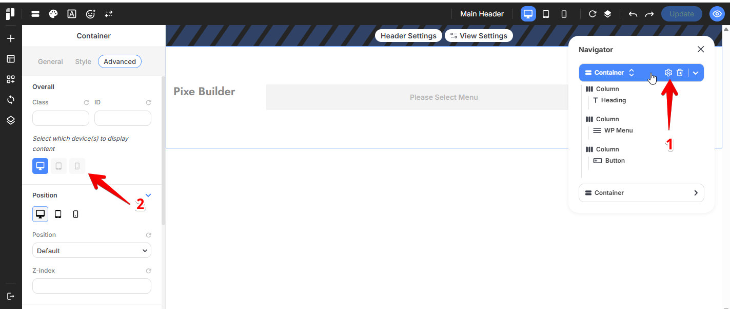
Hiding the desktop header on smaller screens: Select the Container element that contains the desktop header, Navigate to its Advanced tab and Click the tablet and mobile icons to disable this container on smaller screens.
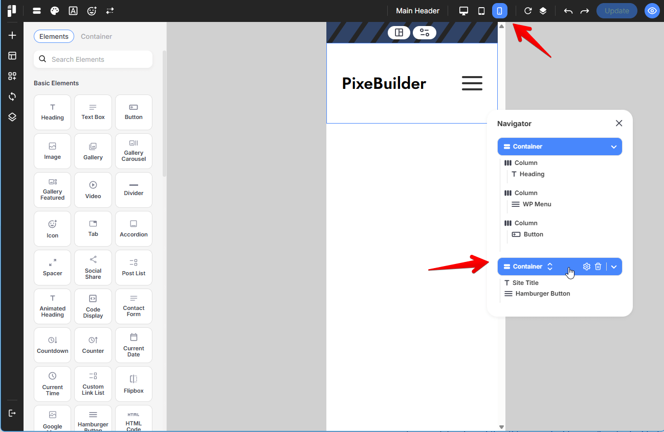
Switch Viewports: In the Header Builder, click the Tablet or Mobile icon in the top bar to enter responsive editing mode.
-
Add Container: Insert a new Container specifically for your mobile layout.
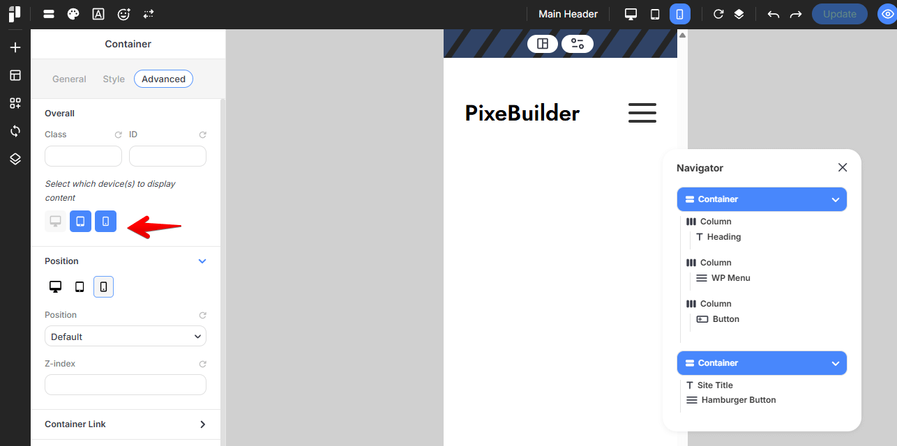
- Set Visibility:
- Navigate to the Advanced tab of the container settings.
- Under Responsive Visibility, ensure the container is set to Show on Tablet and Mobile, but Hide on Desktop.
- Primary Elements: Within this container, typically include your site Logo and the Hamburger Button element.
For more information regarding the header setup, please go through the Header Builder documentation here: https://docs.pixebuilder.com/header-builder/
Designing the Mobile Menu Popup
The Hamburger Button does not contain the menu items itself; it acts as a trigger to open a Popup template.
You can either use(or edit) the prebuilt mobile menu popup or create it from scratch:
Using the PreBuilt Popup:
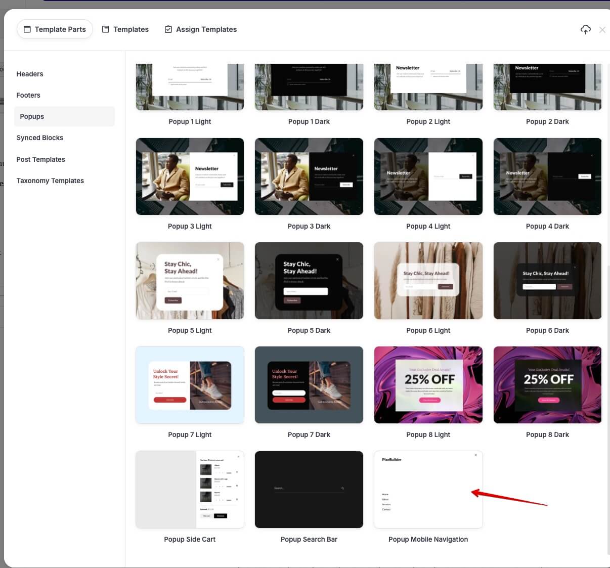
If you want a professional layout quickly, you can choose the Prebuilt Popup Mobile Nav or use it as a starter template for your design.
Create from Scratch:
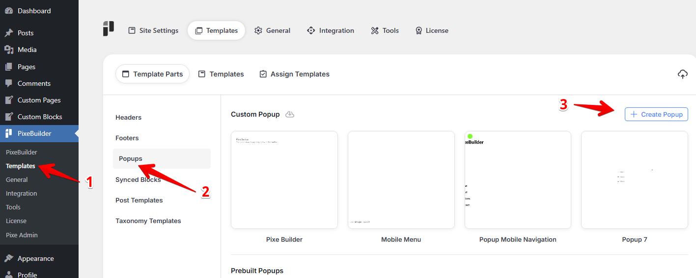
Access Popup Manager: Navigate to PixeBuilder > Templates in your WordPress dashboard and select the Popups category.
-
Create New Popup: Click + Create Popup, name it (e.g., "Mobile Navigation"), and open the editor.
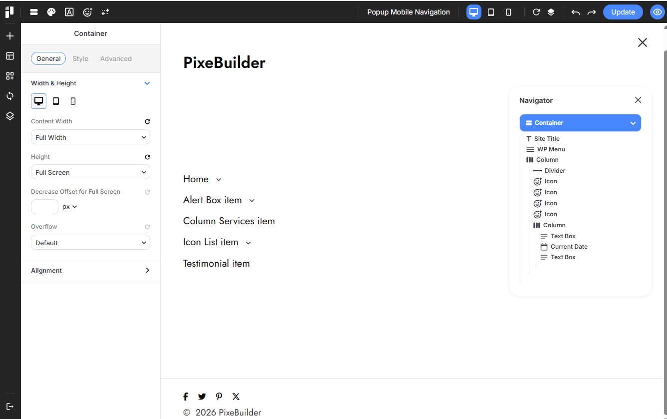
Inside the Popup Builder, we recommend adding the following elements for a complete mobile experience:
-
Logo: Add a Logo element at the top so users always know which site they are browsing.
-
WP Menu: Insert the WP Menu element. You can style this specifically for mobile, such as using a vertical layout with larger touch targets.
-
Social Icons: Include Social Icons at the bottom of the popup to encourage social engagement.
-
Linking the Hamburger Button to the Popup
Once your popup is saved, you must link it to the trigger button in your header.
-
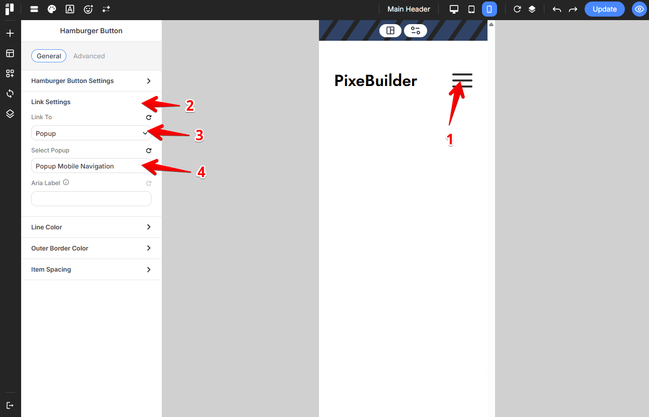
Select the Button: In your Header Builder (Mobile View), click on the Hamburger Button element.
-
Configure Link Settings:
-
Open the General settings tab in the sidebar.
-
Locate the Link Settings dropdown.
-
Set the Link To option to Popup.
-
Under Select Popup, choose your "Mobile Navigation" popup from the list.
-
-
Update: Save your changes to activate the connection.
Summary Checklist
-
Desktop View: Show your full menu; hide the mobile container.
-
Mobile View: Hide the desktop menu; show the mobile container with the Hamburger trigger.
-
Popup Template: Ensure your mobile menu is designed and saved in the Popups section.
-
Trigger Link: Verify that the Hamburger Button is specifically linked to the correct Popup template.