Advanced Column
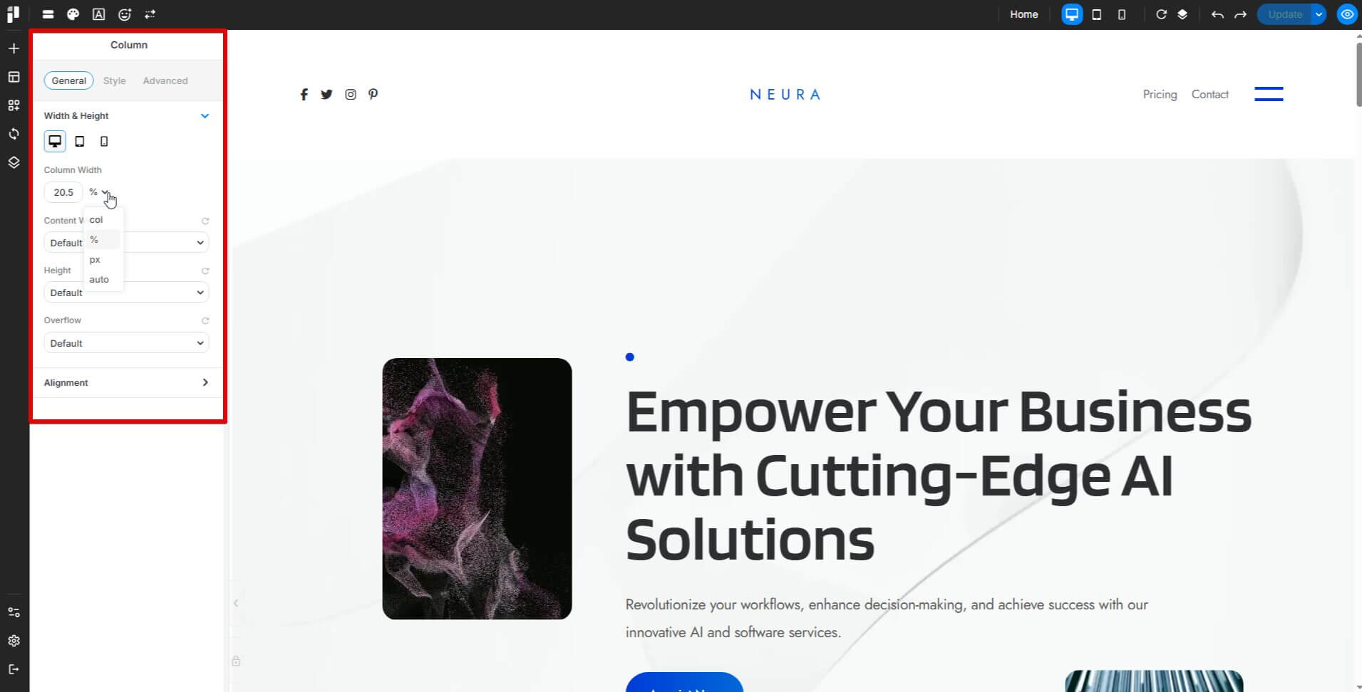
In the column settings, you can define its size using percent, column (col), pixel, or auto.We also introduce Blend Mode and Filters in the column style settings to give more styles to images.
General
The General tab lets you adjust width, height, alignment, and flex properties.
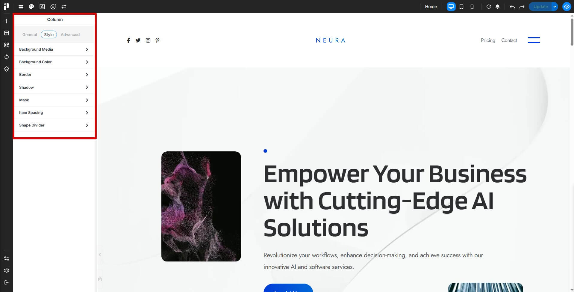
Style
The Style tab offers background customization with image, video, or map options, plus controls for positioning, opacity, blending modes, and filters. You can also tweak borders, shadows, and spacing.
Advanced
The Advanced tab provides custom styling with class and ID inputs, z-index, positioning, animations, and custom CSS. Fine-tune your design with column links, background extensions, and hover effects for a fully customized layout.
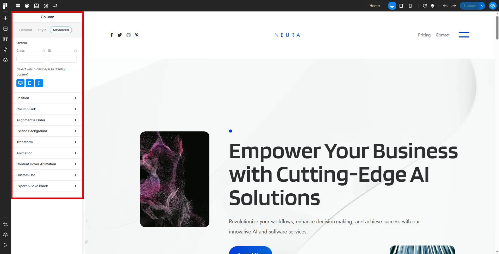
Overall
-
Allows users to define custom class names and IDs for advanced styling and scripting.
-
Includes Z-index settings to control element stacking.
-
Provides positioning options such as absolute, fixed, or relative.
-
Includes responsive display settings to control visibility on different devices.
Column Link
-
Enables adding a hyperlink to the entire column, making it clickable.
Alignment & Order
-
Adjusts the column's placement within a section.
-
Configures flex properties, including basis, grow, shrink, and order.
Extend Background
-
Allows the background to extend beyond the default column boundaries.
Animation
-
Adds animation effects, duration, and delay to the column.
-
Enables or disables the Loop Animation setting.
Transform
-
Provides options for scaling, rotation, skewing, offset, and trigger effects for both normal and hover states.
Custom CSS
-
Available for premium users, allowing direct CSS customization for a specific column.
Export & Save Block
-
Saves the column layout as a custom block for future use.
-
Saves the column layout as a synced block for consistency across multiple pages.
Content Hover Animation
- Adds hover animation effects with customizable duration and delay settings.
Propagate Hover Color
- Applies hover color only to child elements that support hover color styling. When enabled, hovering the column or container switches all supported child elements from their normal color to their hover color together.
Layout Ideas with Columns
-
Half-Half Layout (50/50 Split):
Picture two columns chilling side by side in a container, each taking up half the space. It’s great for comparing things, pairing text with pictures, or keeping everything balanced. -
One-Third Layout (33/66 Split or 25/50/25):
This one’s super flexible. Split it unevenly or go wild with three parts—perfect for showing off features, pricing options, or happy customer quotes. -
Full-Width Background with Nested Columns:
Start with a container rocking a big, bold background, like a stunning image or a splash of color. Then drop some columns on top to keep your content neat. This setup shines for hero sections, call-to-action spots, or eye-catching banners.
Container Management
1. Introduction: Understanding Containers & Columns
When you're putting together a webpage, Containers and Columns are your go-to buddies for keeping things neat and tidy.
Think of Containers as big, friendly boxes that wrap around your content, holding everything together. Inside those boxes, you’ve got Columns, little sections that split up the space so your stuff doesn’t end up in a messy pile.
When you mix Containers and Columns just right, it’s like magic: your webpage turns into something easy on the eyes, super organized, and ready to adjust to any screen size.
2. Difference Between Containers & Columns
| Feature | Container | Column |
|---|---|---|
| Purpose | Holds multiple columns and organizes page structure | Divides content within a container into sections |
| Background | Can have its own background, stretching across the page | Can have different backgrounds but usually sits on top of a container |
| Layout Control | Manages spacing, padding, and global alignment | Helps in arranging text, images, and other elements |
| Nesting | Can contain multiple columns | Can contain columns, as well as elements |
3. How to Use Containers & Columns
Containers are your big-picture helpers. They’re perfect for shaping sections, adding cool backgrounds, or stretching things out to full width.
Columns, on the other hand, are the organizers inside those containers. They tidy up your content so it’s easy to read and looks sharp, no matter the screen.
4. Making It Your Own with Customization
-
Containers:
Dress them up with background colors, images, gradients, or even videos. They also control padding and spacing, so everything sits just right. -
Columns:
Each one can have its own vibe, colors, borders, or slick box shadows. You can tweak their alignment and spacing too, thanks to flexbox magic.
5. Tips for Containers & Columns
-
Keep it simple—don’t overdo the nesting, or things get messy fast.
-
Go big with full-width containers when you want to grab attention with visuals.
-
Mix text, images, and some breathing room (white space) so it’s easy to look at and enjoy.
-
Use flexbox settings to nail perfect alignment and flow for your columns.