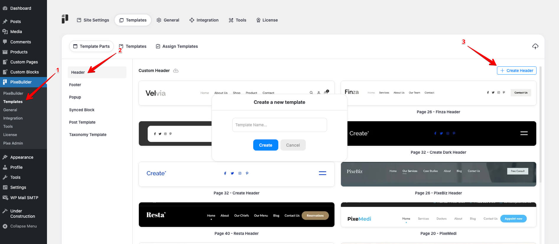
Create Header Template
Here are a few simple steps to create the header template:
- Go to Pixe Settings
- Access Template Parts
- Click on Header
- Click Create Header
- Enter a Template Name
- Design your custom header here
Header Template Structure
We usually include the following elements in the header structure:
- Logo
- Menu/Navigation
- Right button
- Login/Registered button
- WooCommerce shopping cart icon
- The header layout can be structured using wrappers, columns, and page items
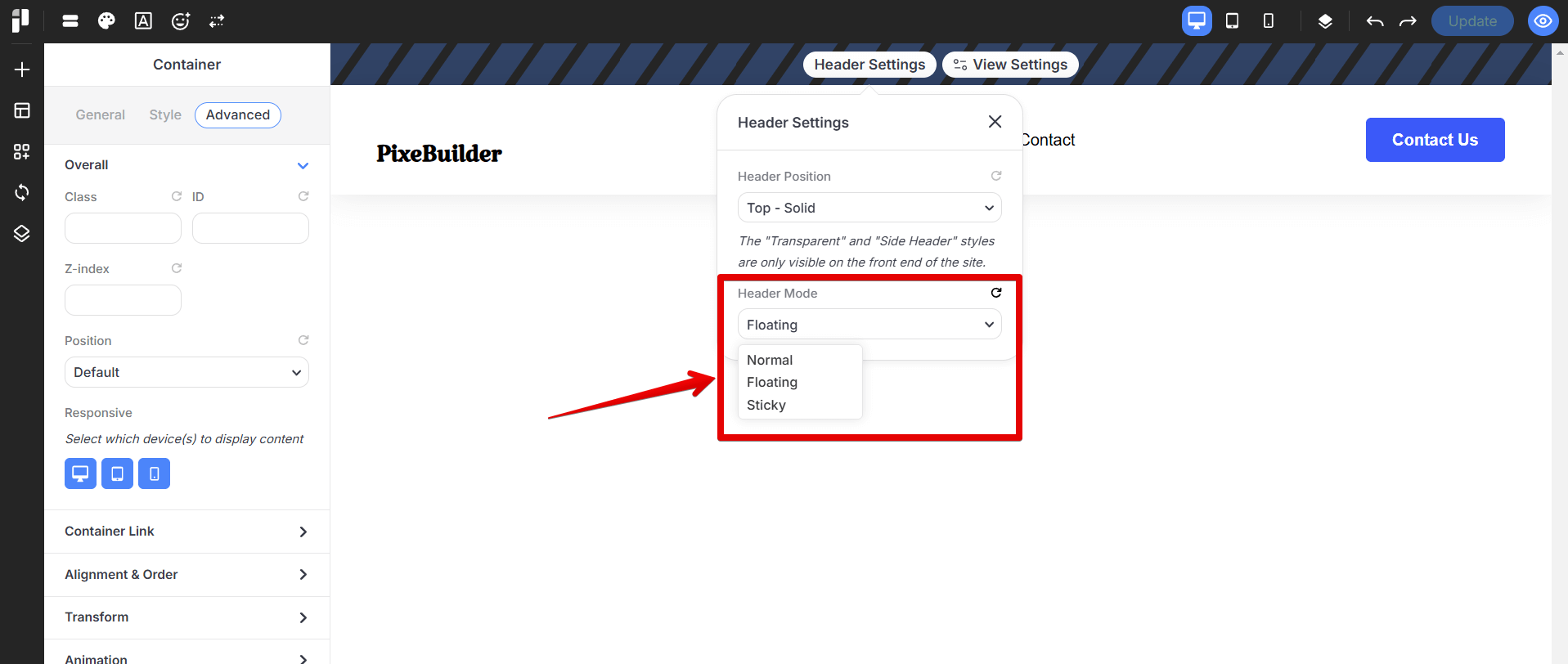
Header Mode
We offer three header modes under Header Settings > Header Mode:
- Normal: The header stays at the top of the page and scrolls away with the content.
- Floating: The header becomes visible only after the user scrolls down slightly.
- Sticky: The header remains fixed at the top of the screen as users scroll.
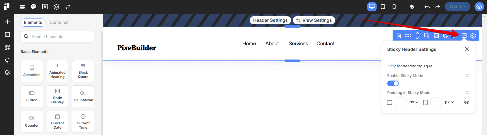
Sticky Header Setting
Note: We also offer a sticky header setting in the wrapper, which only applies to the Header Top style.
Responsive Display Settings
In PixeBuilder, you can control which devices your content appears on using the Responsive Display settings.
Access the responsive setting in:
- Desktop: Show or hide the content on desktop devices (large screens).
- Tablet: Show or hide the content on tablets (medium screens).
- Mobile: Show or hide the content on mobile devices (small screens).
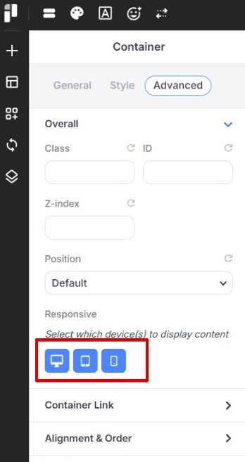
Simply click the icons to enable or disable visibility for each device type.
This gives you full control over how your layout adapts to different screen sizes, helping you create a truly responsive and optimized website. For instance, you could create a new container designed to appear exclusively on tablet and mobile; within this container, you can swap the standard WordPress Menu for a Hamburger icon that triggers a mobile-specific popup menu.
For in-depth instructions on configuring the mobile header to display specific elements across desktop, tablet, and mobile views, refer to this article: https://docs.pixebuilder.com/mobile-menu-setup/
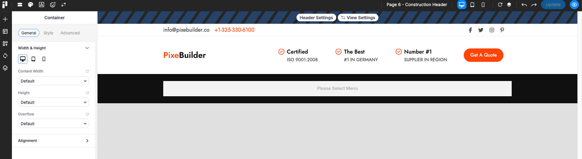
Desktop
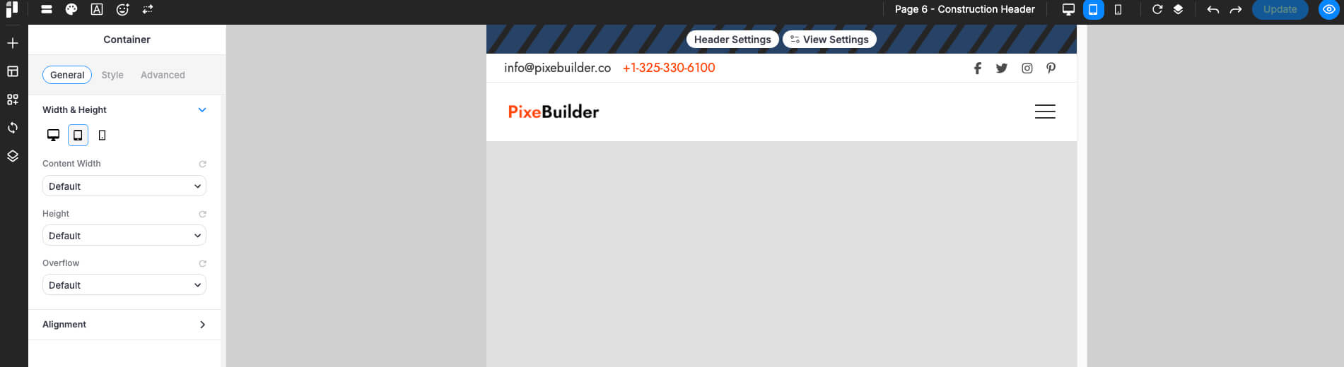
Tablet
Mobile
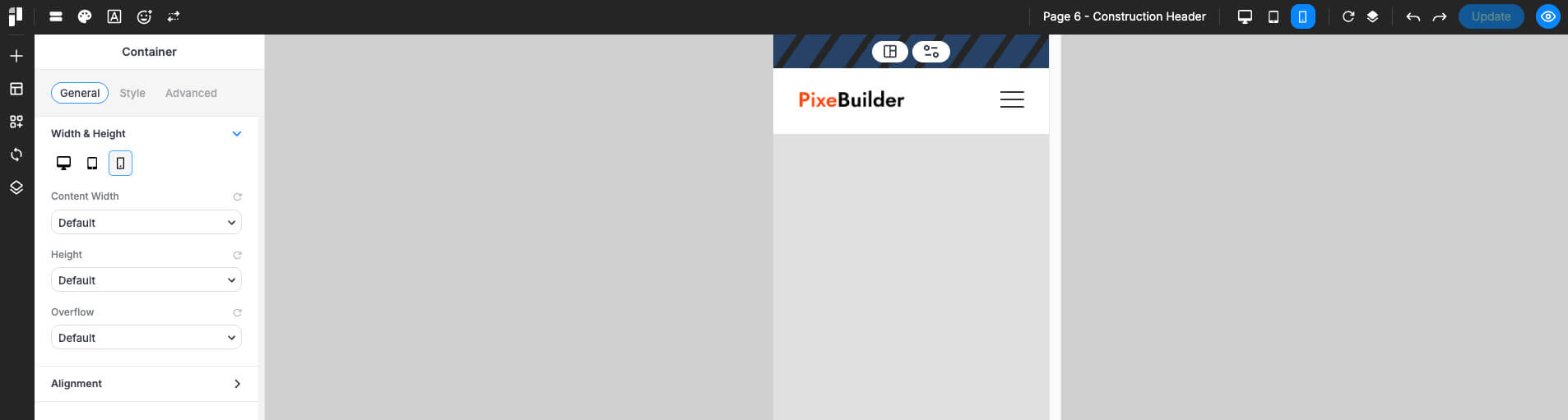
Mobile Navigation (Hamburger Menu)
For mobile and tablet layouts, it is standard practice to use a Hamburger Button to conserve screen space. In PixeBuilder, this button acts as a trigger to open a custom-designed popup containing your menu.
Create a Mobile Menu Popup: Navigate to PixeBuilder > Templates > Popups and design a new template containing your mobile navigation links.
More information about the popup builder can be found here: https://docs.pixebuilder.com/popup-builder/
Link to the Popup:
-
-
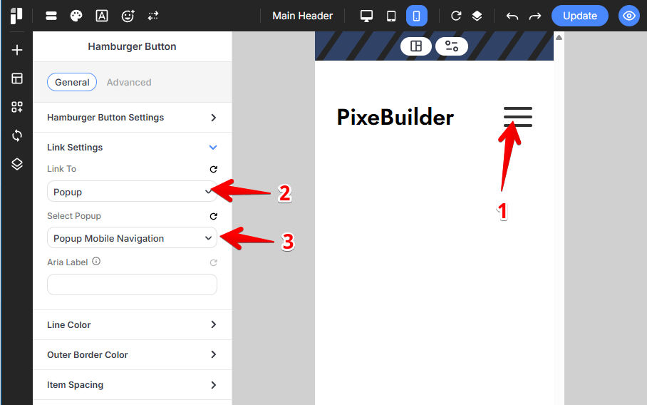
Select the Hamburger Button and open the General tab in the sidebar settings.
-
Expand the Link Settings section.
-
Set Link To to Popup.
-
Under Select Popup, choose your pre-designed mobile menu popup from the dropdown menu.
-
Customize Header by Device in PixeBuilder
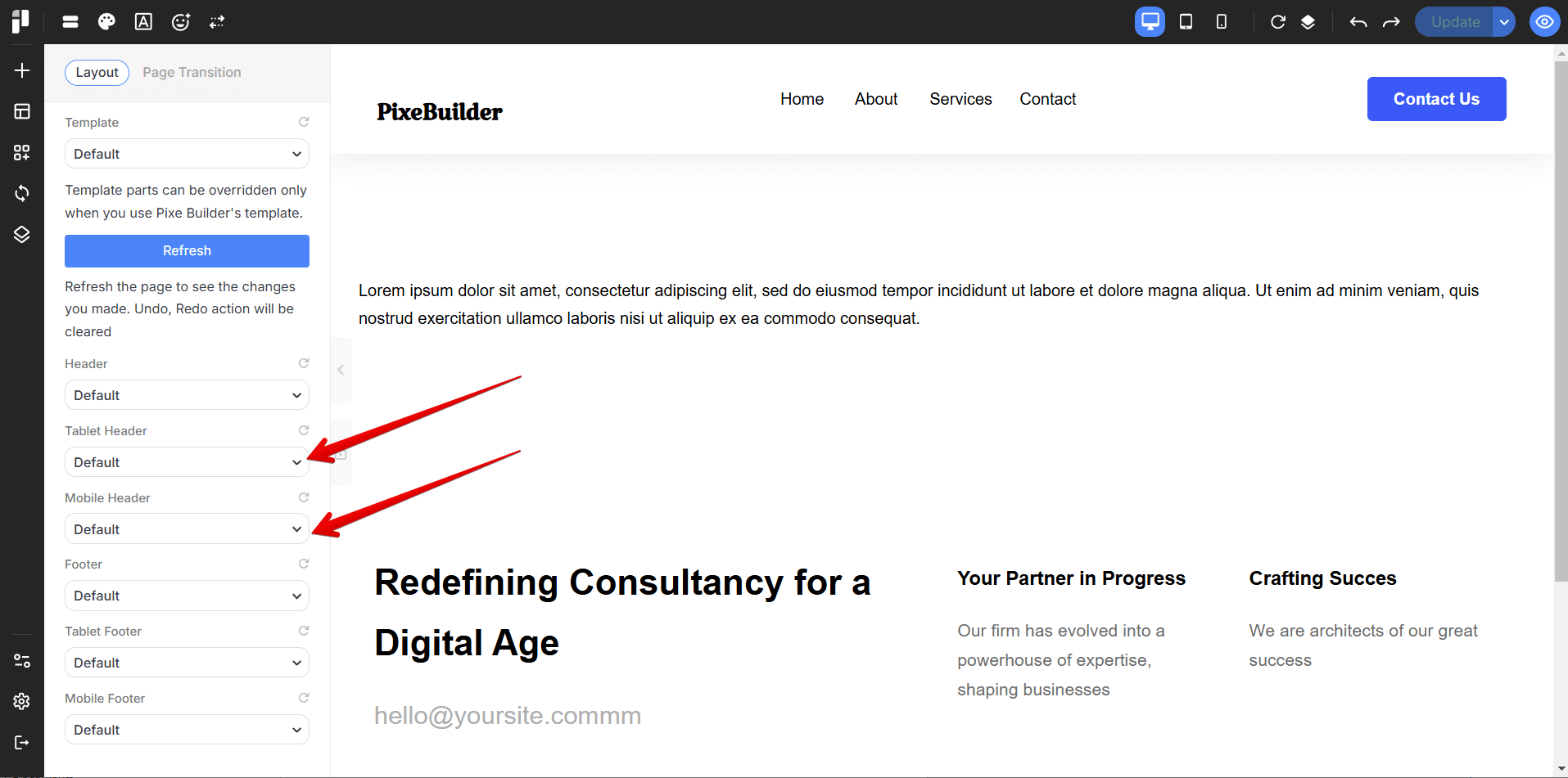
With PixeBuilder, you can easily assign different Headers for desktop, tablet, and mobile devices.
Besides using the default settings, you can also create separate Headers specifically for tablets and mobiles, and assign them directly in the template or page settings. This ensures a better layout and user experience across all devices.
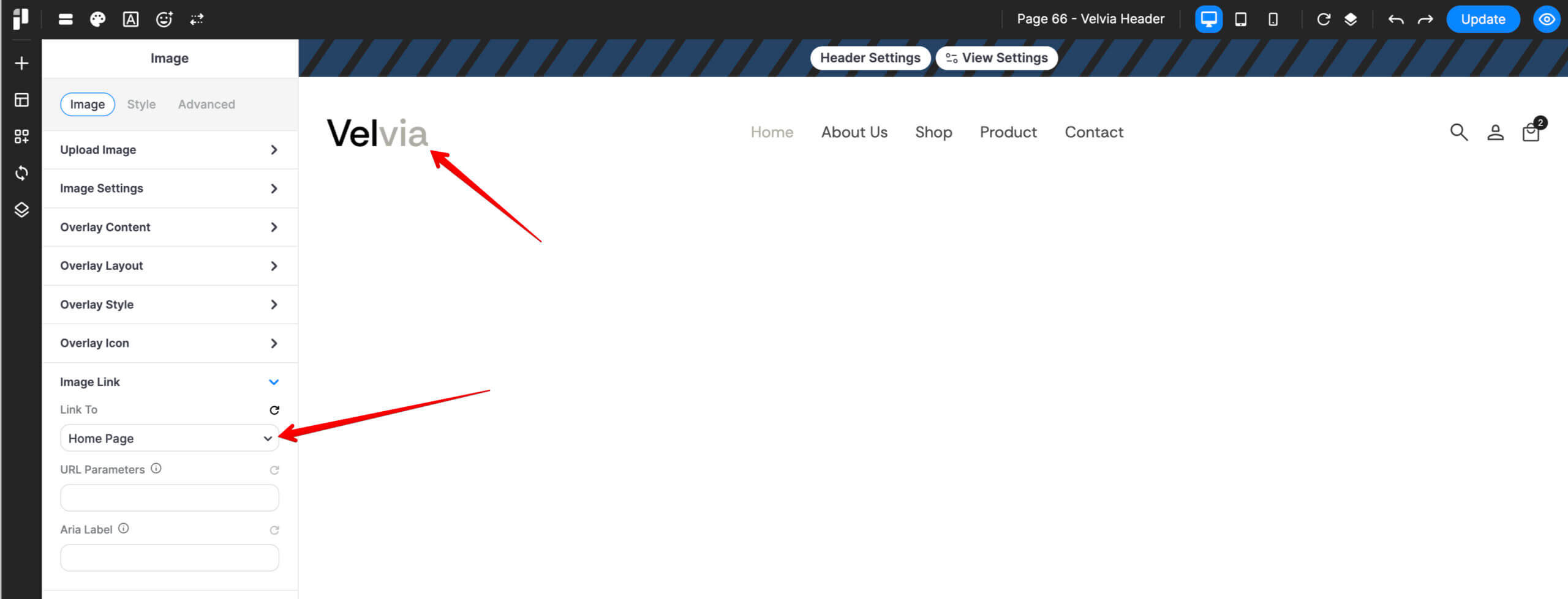
Linking the Site Logo to the Home Page
1. Select the Image Element
- Open your header template in the PixeBuilder editor.
- Click on the Image element (e.g., "Velvia") in the central canvas area to activate its settings.
2. Access Image Link Settings
- In the left-hand sidebar, ensure you are on the Image tab.
- Scroll down the accordion menu and click on Image Link to expand the options.
3. Configure the Link Destination
- Link To: Click the dropdown menu and select Home Page from the list of available site pages.
- URL Parameters (Optional): Leave this blank unless you need specific tracking codes for your homepage hits.
- Aria Label: For better accessibility (SEO), it is recommended to type "Go to Home" or "Home" in this field.
4. Save Your Changes
- Once the "Link To" field displays Home Page, click the blue Update button in the top-right corner of the screen to push the changes live.