Navigation Presets in PixeBuilder allow you to design and save custom directional arrows for sliders, carousels, and other interactive content. This feature provides granular control over icon choice, sizing, and background styling to ensure your navigation elements align with your site's aesthetic.
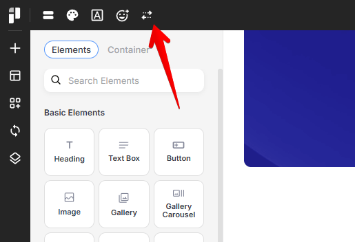
The Navigation Preset manager can be accessed from the left corner of the top bar:
Selecting or Creating Styles
You can choose from a library of built-in presets or build your own from scratch.
-
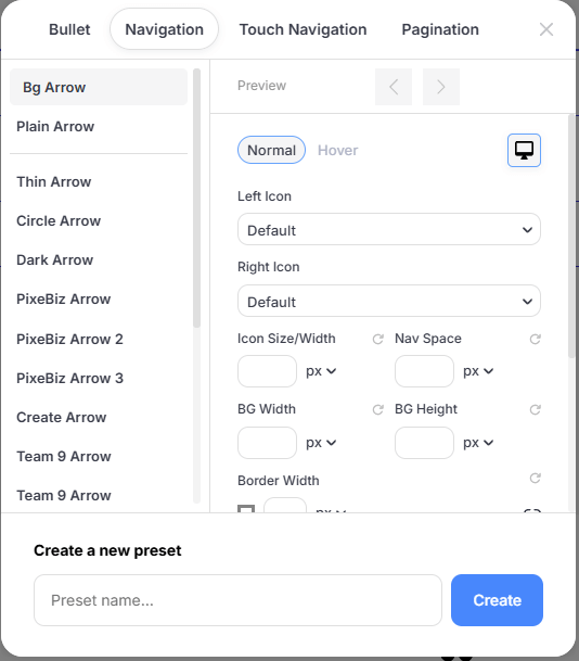
Built-in Presets: Choose from classic shapes like Thin Arrow, Circle Arrow, Transparent Arrow and Dark Arrow.
-
Creating a New Preset:
1. At the bottom of the Bullet Manager, locate the Create a new preset section.
2. Enter a unique name in the Preset name... field.
3. Click the Create button.
Your new preset will now appear in the list for further customization.
Design and Appearance
Once a preset is created, you can fine-tune its look for different interaction states and screen sizes.
State Selection
Define how your arrows look during different interactions:
-
Normal: The default appearance of the navigation arrows.
-
Hover: The appearance when a user moves their cursor over the arrow.
Icon Selection & Sizing
-
Left & Right Icon: Choose specific icons for the directional arrows from the integrated icon library.
-
Icon Size/Width: Set the precise pixel (px) dimensions for the icons.
-
Nav Space: Adjust the distance between the navigation elements.
Background & Border Style
-
BG Width & Height: Control the dimensions of the background container for the arrows.
-
Border Width: Add an outline to your arrows. You can link all sides for a uniform border.
-
Border Radius: Create sharp corners (0px) or perfectly round backgrounds by increasing the radius.
Colors
-
Icon & Svg Color: Select the primary color for the arrow icon.
-
Background Color: Define the fill color of the arrow's container.
-
Border Color: Set the color of the arrow's outline.
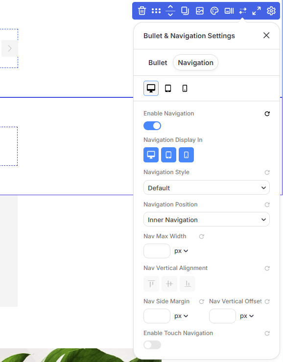
Responsive Design (Desktop vs. Mobile)
Optimizing your navigation for different devices ensures a better user experience:
-
Use the Device Toggle (Computer/Tablet/Phone icons) to set unique sizes for each viewport.
-
Desktop: Keep arrows precise and smaller for mouse-based navigation.
-
Mobile/Tablet: Increase the BG Width and Height to create larger, "finger-friendly" touch targets for mobile users.
Using Navigation Arrows
Bullets can be enabled in the Slider Container, Gallery Carousel, Carousel Container, and Post List modules: