The Slider Container in PixeBuilder is a flexible design element that allows you to create slideshows by stacking different content into individual slides. Each slide can contain containers, columns, and content blocks like headings, images, or buttons, giving you full design freedom.
When using Slider Container in a Post Template, make sure the Fetch Items value matches the number of slides in the slider or carousel to ensure the layout displays correctly.
How to Use the Slider Container
-
Add a Slider to your page using the PixeBuilder editor.
-
Inside the slider, add columns or containers — this is where you place your actual content (text, images, CTAs, etc.).
-
Each “slide” can be customized individually.
-
You can also configure global settings like height, animation, autoplay, and navigation.
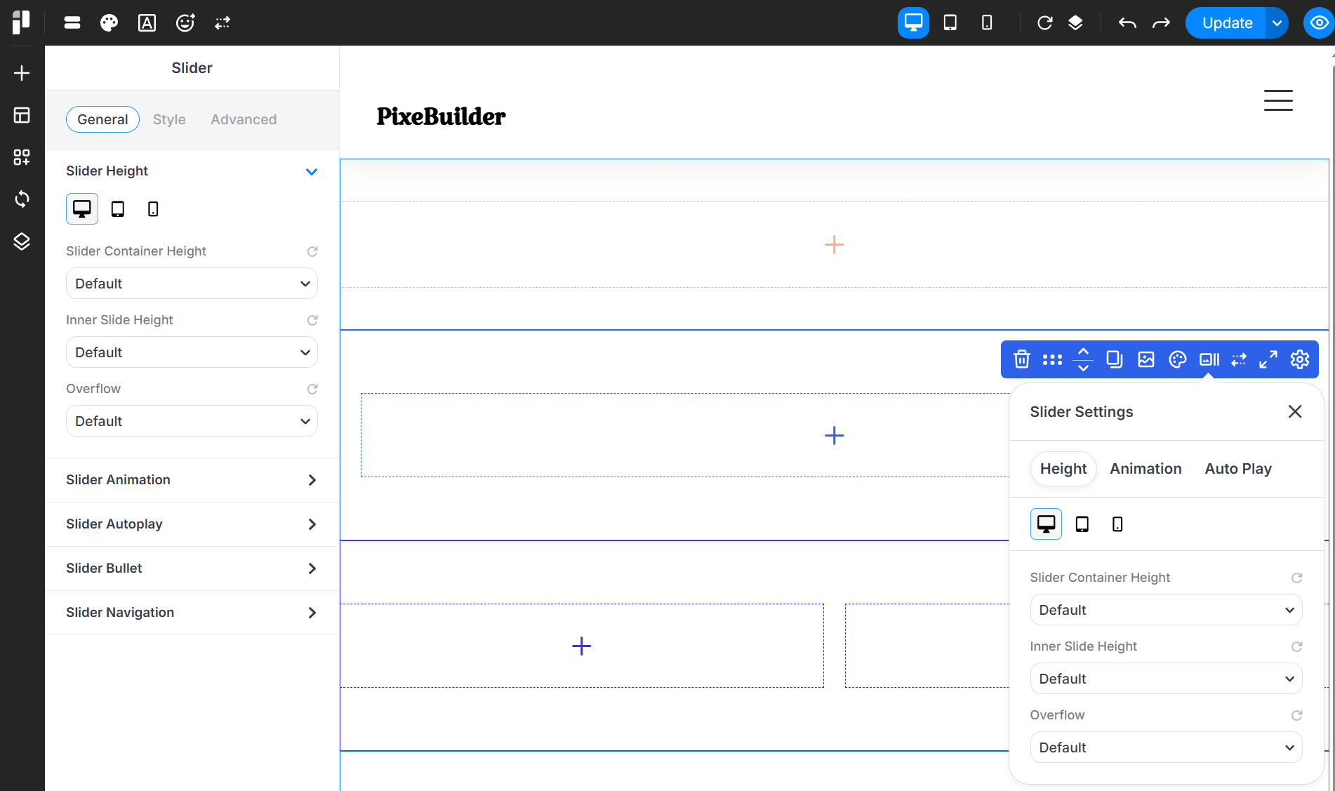
Main Slider Settings
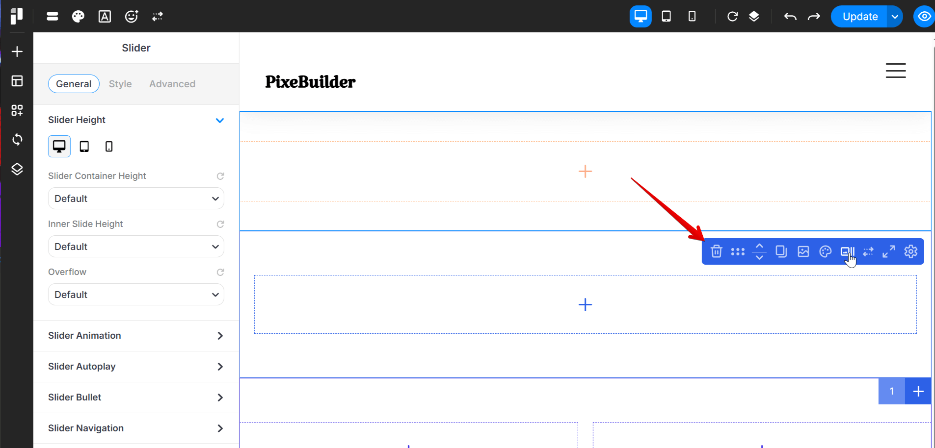
- Removes the slide.
- Allows you to rearrange the order of slider container with other items.
- Creates an exact copy of the whole slide.
- Very helpful for quickly reusing slide layouts or animations to other places.
- Opens background media settings (image, video).
- Set unique backgrounds for the whole slide to create a storytelling flow.
- When you set both color and image, you can set opacity in the background image setting so there will be a color overlay for all sliders.
- Open settings for adding color, border, shadow and mask.
- Set the height for the slider container, inner slides, and overflow behavior.
- Configure animation settings for the entire slider container.
- Set autoplay options, including slide duration and enabling/disabling pause on hover for the inner slider.
- Enable bullets or navigation controls for the entire slider.
- Control the spacing of the slider by adjusting its padding and margin.
Sub Slider Settings
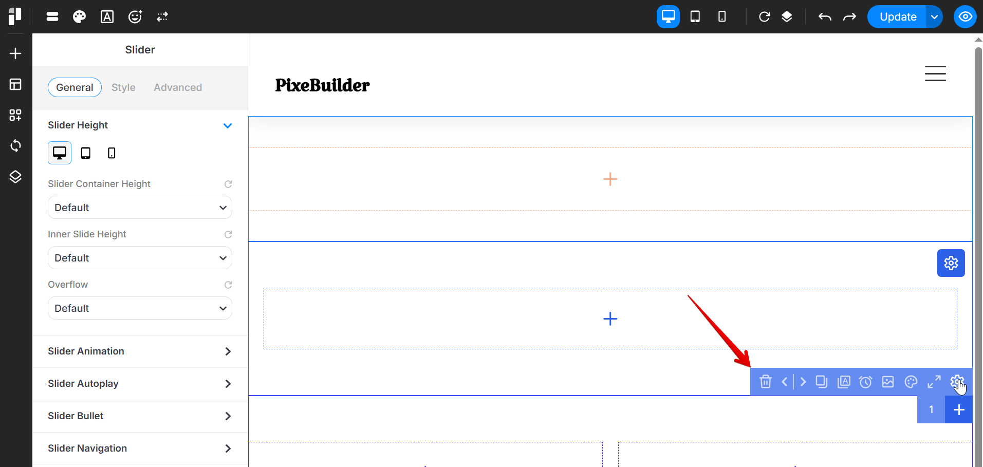
- Removes the current sub slide from the slider.
- A confirmation prompt usually appears to prevent accidental deletion.
- Allows you to rearrange the order of sub slides within the slider.
- Creates an exact copy of the selected sub slide.
- Helpful for quickly reusing slide layouts or animations.
- Keeps the selected sub slide content on top by applying a higher z-index.
- Set the display duration of the current sub slide in milliseconds.
- Open background media settings such as image or video.
- Set a unique background for the current sub slide.
- Overrides the background defined in the Main Slider settings.
- If both color and image are set, image opacity can be adjusted to create a color overlay.
- Open settings for color, border, shadow, and mask.
- Control the spacing of the sub slide by adjusting padding and margin.