In this guide, we will explore how to enable and customize the Touch Navigation feature. This tool is essential for providing a seamless, touch-friendly browsing experience for users on mobile devices and tablets, as well as modern touch-enabled desktops.
1. Enabling Touch Navigation
The Touch Navigation settings are available within the Slider Container, Carousel Container, and Post List modules. To get started:
- Open your element settings (e.g., Post List).
- Navigate to the General tab and locate Navigation Settings (indicated by the horizontal arrow icon).
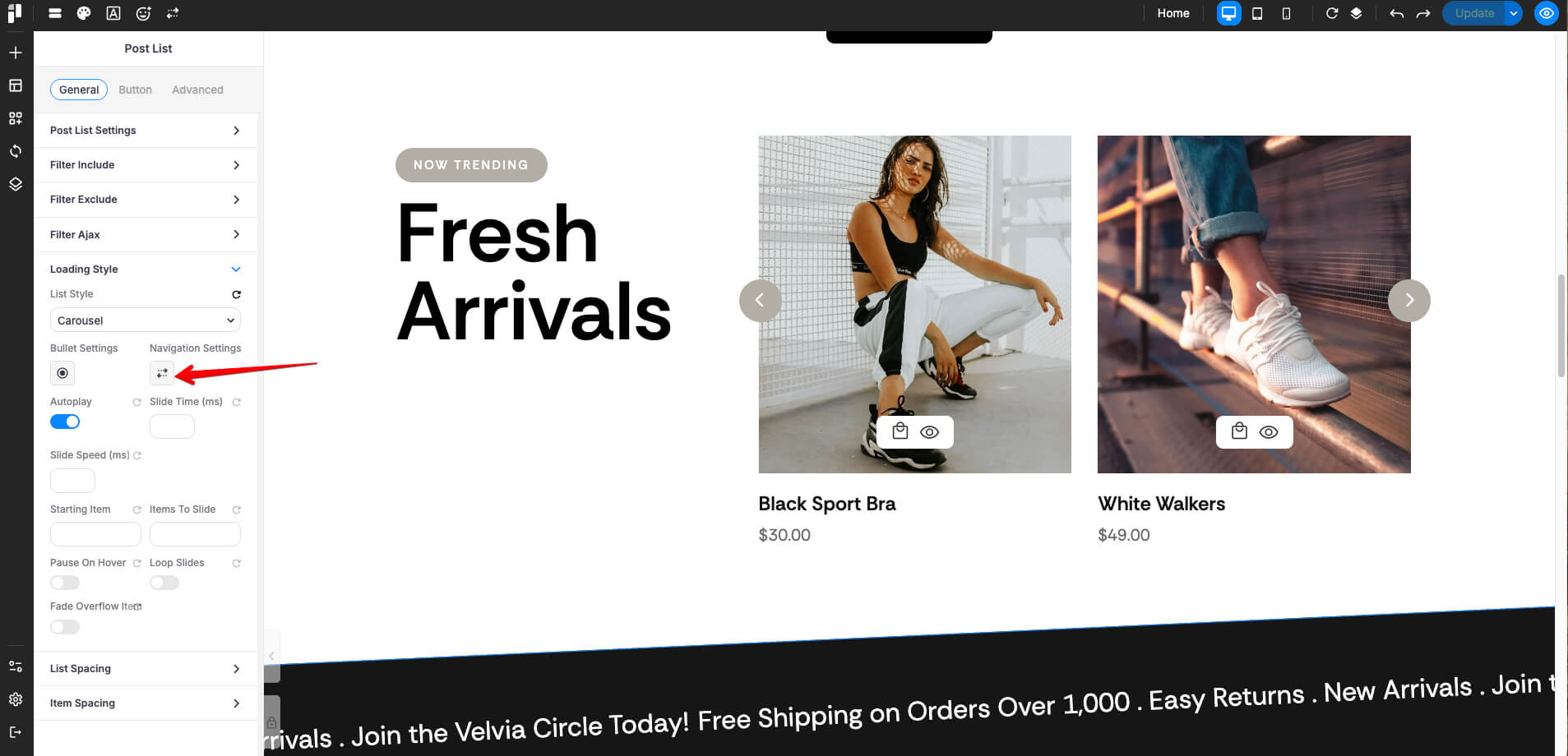
- Toggle on Enable Touch Navigation.
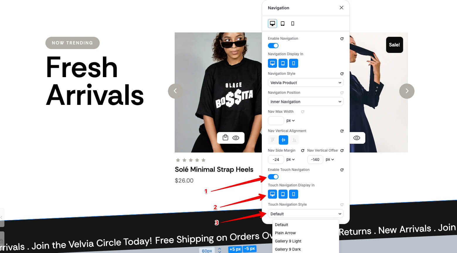
- Under Touch Navigation Display In, select the devices where you want this navigation style to appear (Desktop, Tablet, or Mobile).
2. Selecting or Creating Styles
You can quickly style your navigation using the Touch Navigation Style dropdown:
- Presets: Choose from pre-defined styles like Plain Arrow, Gallery 9 Light, or Gallery 9 Dark.
- Accessing the Preset Manager: Click on the Navigation Icon or select Open Preset from the dropdown menu to enter the detailed customization panel.
3. Creating a New Preset
Before you begin customizing the design, you must create a new Preset.
-
Open the Touch Navigation Style dropdown and select Open Preset.
-
Scroll to the bottom of the manager to the Create a new preset section.
-
Enter a descriptive name in the Preset name... field.
-
Click the Create button.
Once created, your new preset will be active and ready for the design phase.
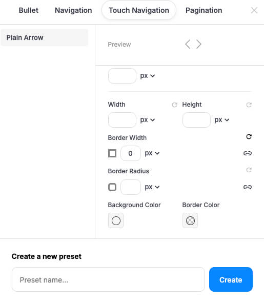
4. Deep Customization in the Preset Manager
The Preset Manager allows you to fine-tune the aesthetics of your navigation arrows.
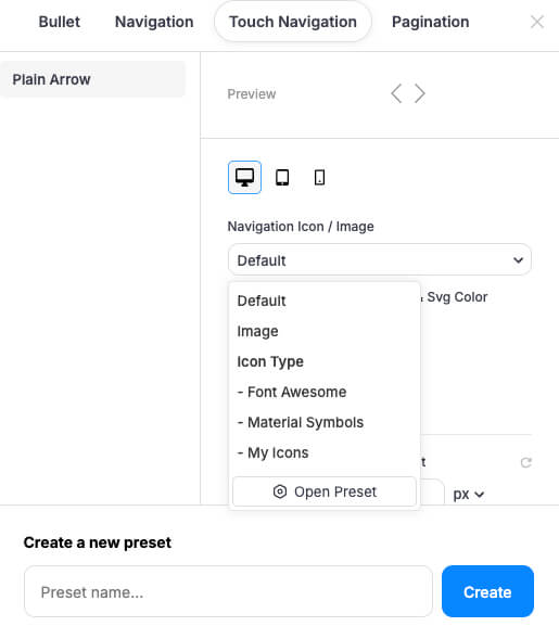
A. Navigation Icon / Image (Desktop Only)
Note: The "Navigation Icon / Image" selection is exclusive to the Desktop view. On Tablet and Mobile, this specific option is hidden to maintain streamlined touch controls.
-
Icon Type: Choose between Default, Font Awesome, Material Symbols, or My Icons.
-
Custom Image: Select "Image" to upload your own custom graphic.
-
SVG Color: If using vector icons, you can set a specific color to match your site's palette.
B. Shape and Appearance (All Devices)
Switch between the Desktop, Tablet, and Mobile tabs to adjust settings responsively:
-
Dimensions: Set the Width and Height in pixels (px).
-
Borders: * Border Width: Set the thickness of the stroke.
-
Border Radius: Adjust the corner roundness (e.g., use a high value for circular buttons).
-
Border Color: Choose a solid or transparent color for the outline.
-
-
Background Color: Set the fill color of the navigation button.