Responsive Setup in Pixe Builder
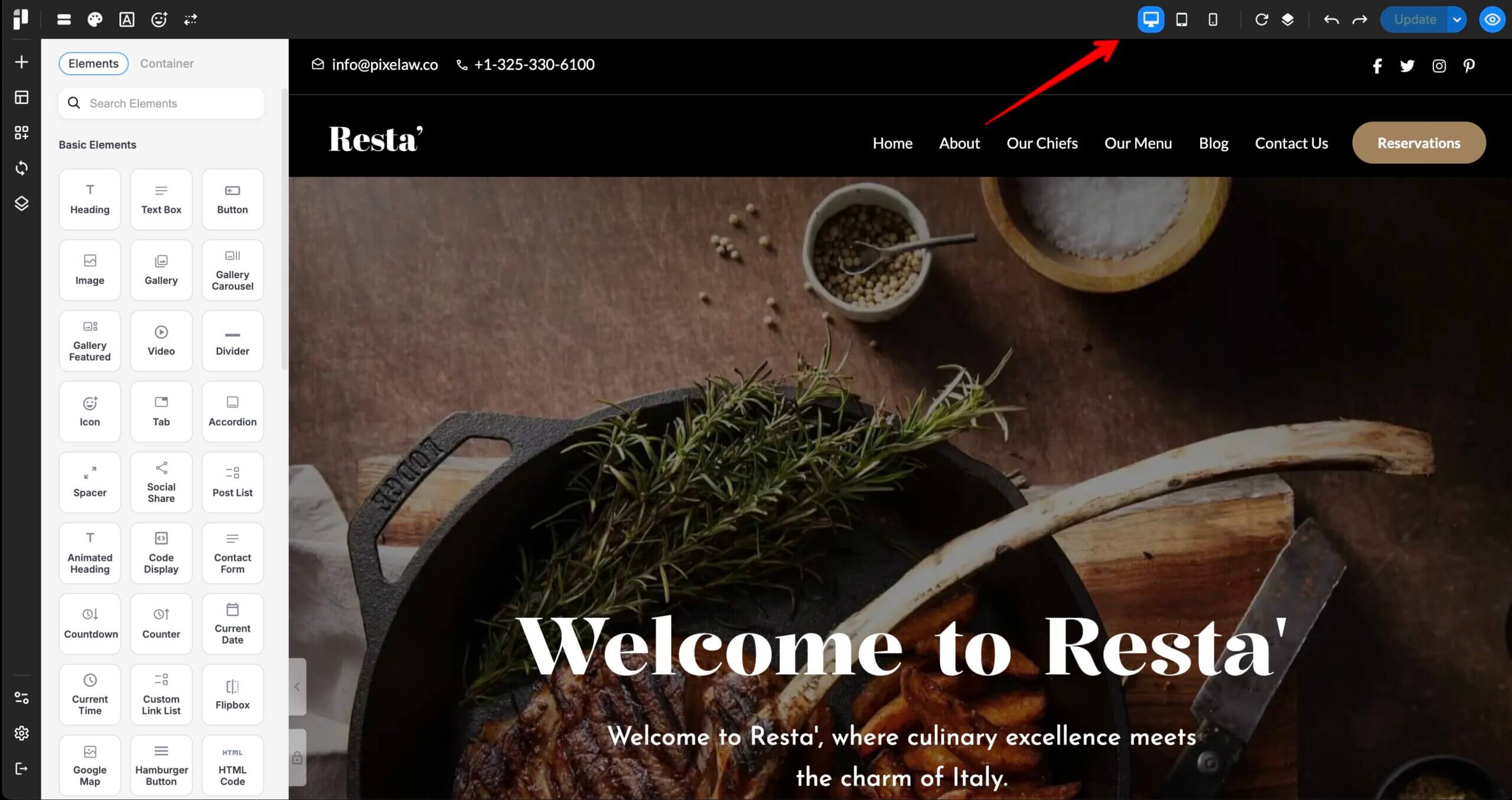
Pixe Builder provides a built-in responsive editing tool located at the top-right corner of the builder interface. You can easily preview and adjust layouts for Desktop, Tablet, and Mobile screens.
Getting Started with Tablet View:
-
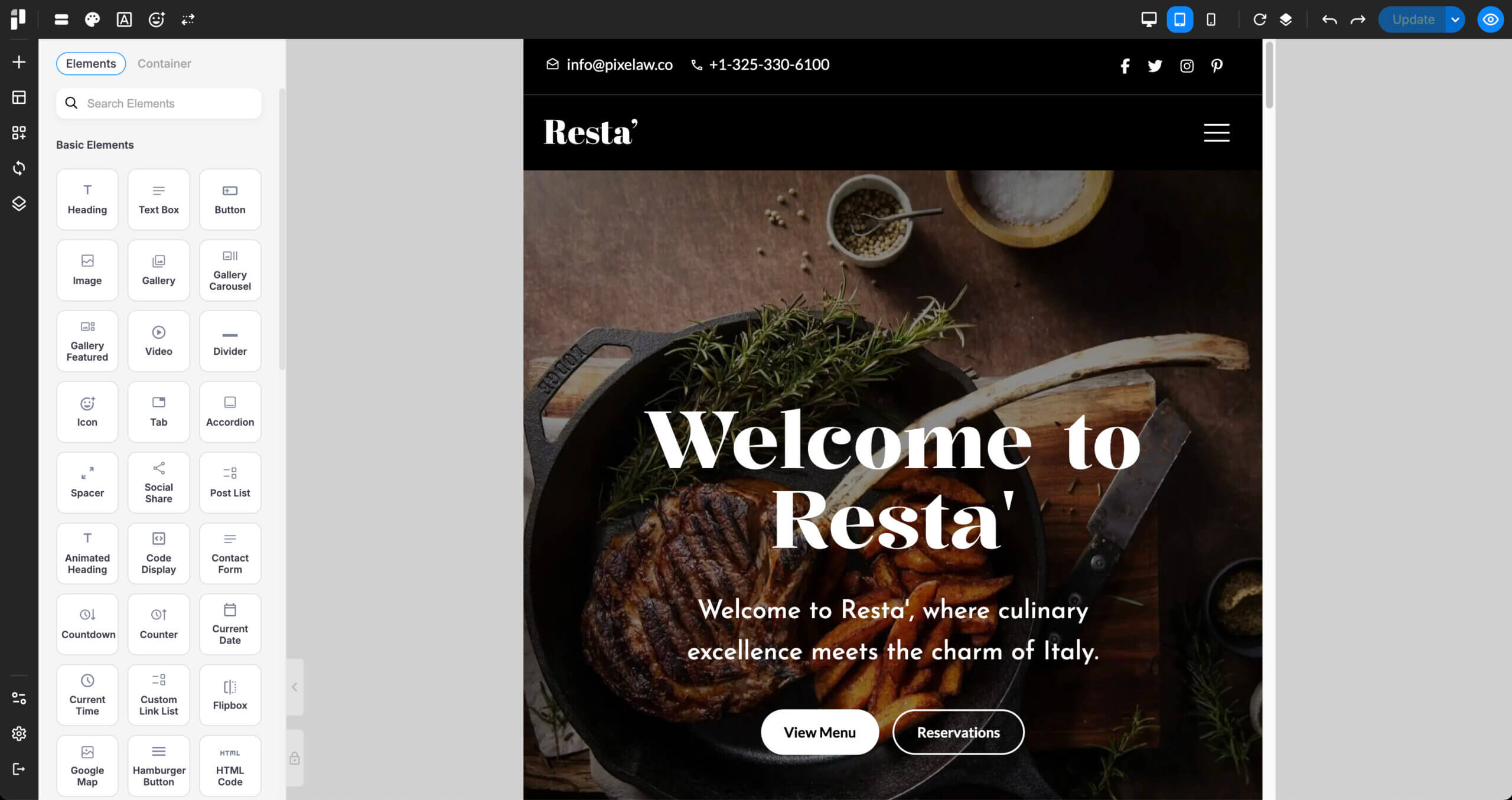
Switch to Tablet View:
-
Click the tablet icon from the top-right responsive switcher.
-
-
Set Horizontal Spacing:
-
To prevent content from appearing too close to the screen edge, set padding on both the left and right sides in the wrapper spacing.
-
-
Adjust Element Sizes:
-
Resize and reposition items within each column to better fit the tablet screen width.
-
-
Customize Tablet-Specific Styles:
-
You can set a unique background color or background image just for the tablet view.
-
These settings will not affect the desktop layout.
-
Adjusting Layout for Mobile View:
-
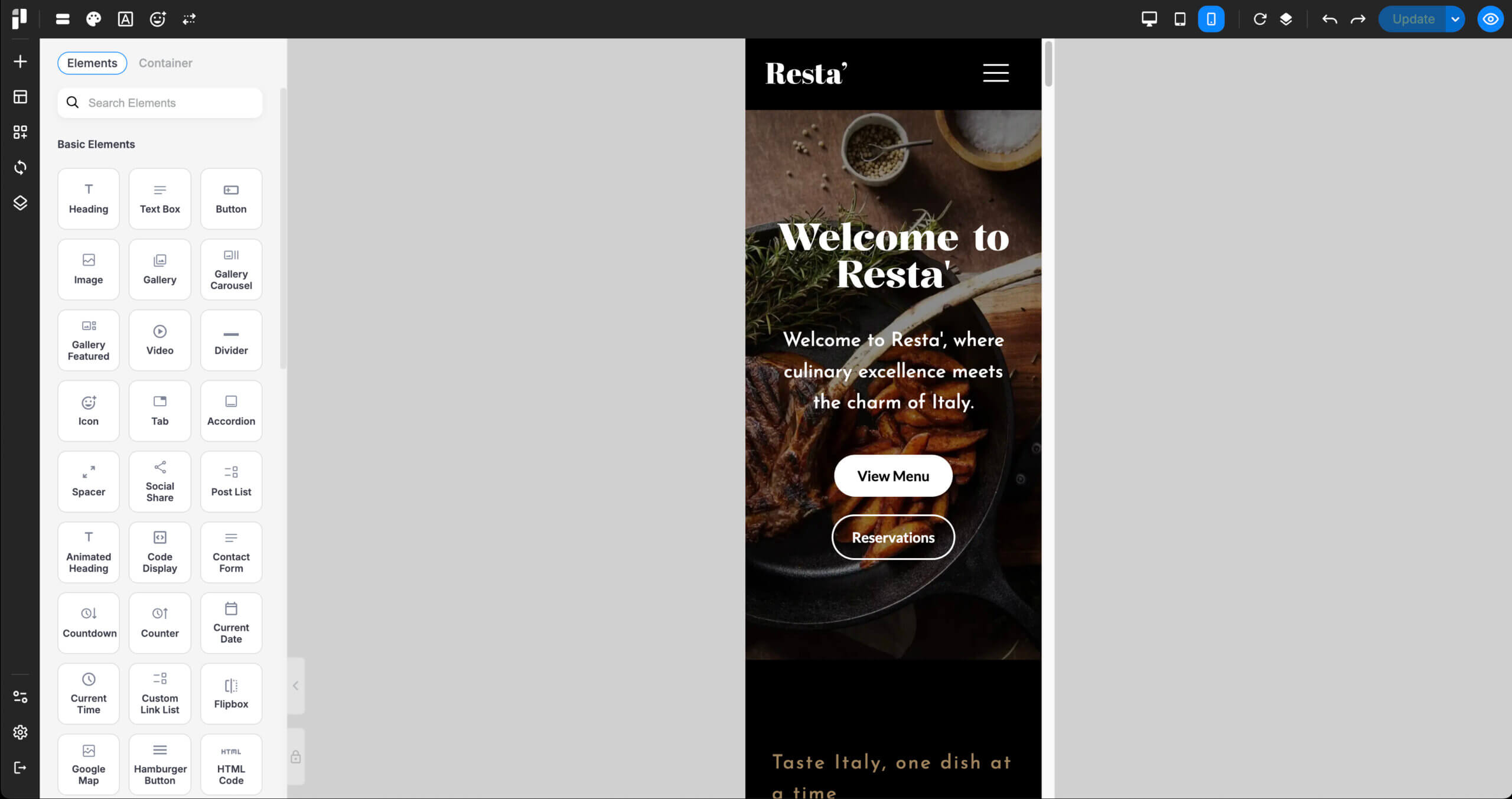
Switch to Mobile View:
-
Click the mobile icon to preview and edit for smartphones.
-
-
Set Column Width:
-
Most designs work best with full-width (1/1) columns on mobile.
-
-
Use Inherited Padding:
-
Padding values from the tablet layout (e.g., 30px) are automatically inherited on mobile. No need to reset them.
-
-
Reorder Content with Flex Order:
-
To move content up or down on mobile, use Flex Order:
-
Go to Item > Advanced > Alignment & Order > Flex Order
-
Reference: MDN: Flexbox Ordering
-
-
-
Style Adjustments:
-
You may also want to change:
-
Font family
-
Font color
-
Background color
-
Background image
These settings can be applied specifically for mobile only within wrappers, columns, or items.
-
-
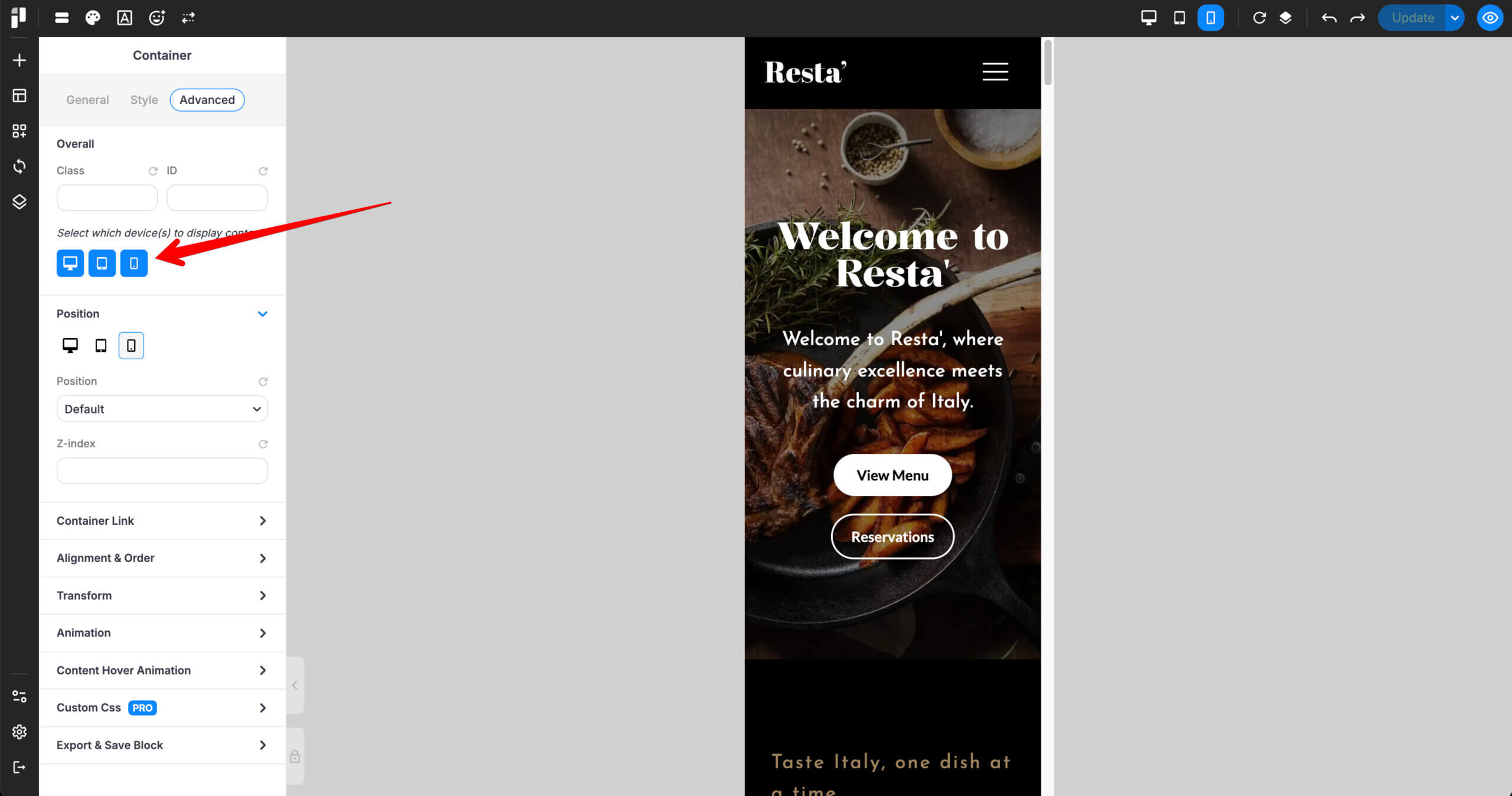
Show or Hide Elements on Different Devices:
-
You can hide elements on specific devices without deleting them:
-
Go to Item > Advanced > Overall
-
Click the icon for Desktop, Tablet, or Mobile to hide that item on the selected device.
-
This is a powerful way to control how your layout appears across all screen sizes in Pixe Builder.